Explore Henri Rousseau’s painting of Bastille Day — a visionary 1892 work that turns French revolutionary history into timeless communal celebration.
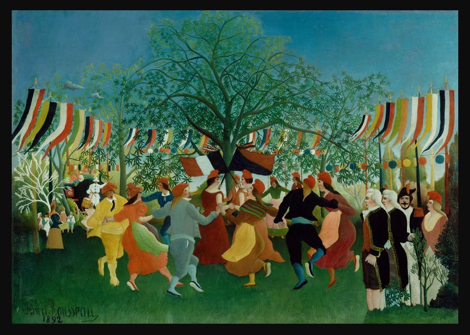
Explore Henri Rousseau’s painting of Bastille Day — a visionary 1892 work that turns French revolutionary history into timeless communal celebration.
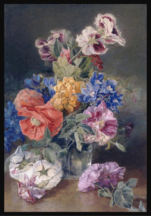
Celebrate July’s Delphinium with James Holland’s radiant 1859 watercolour, where Victorian flower symbolism, luminous colour, and the dreamer’s heart bloom together in a timeless summer bouquet.
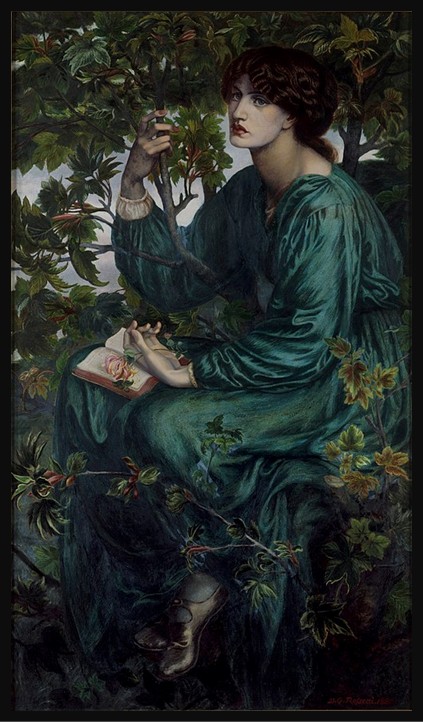
Rossetti’s The Day Dream captures Jane Morris in a moment of stillness—where symbolism, desire, and interiority intertwine within one of the most atmospheric Pre-Raphaelite paintings.
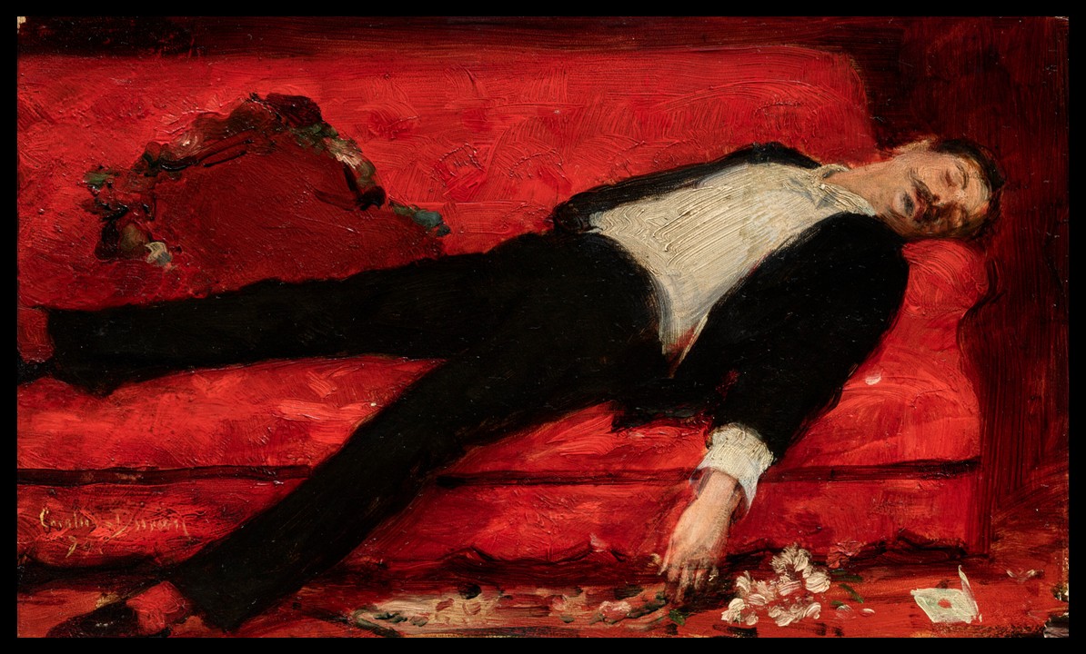
A letter lies torn open on the floor. Beside it, a bouquet, discarded, not placed. On the sofa above them, a young man has collapsed into the cushions, eyes closed, one arm surrendered to gravity. Something has happened in this room. Carolus-Duran’s The Letter (1889) offers two stories and refuses to choose between them.
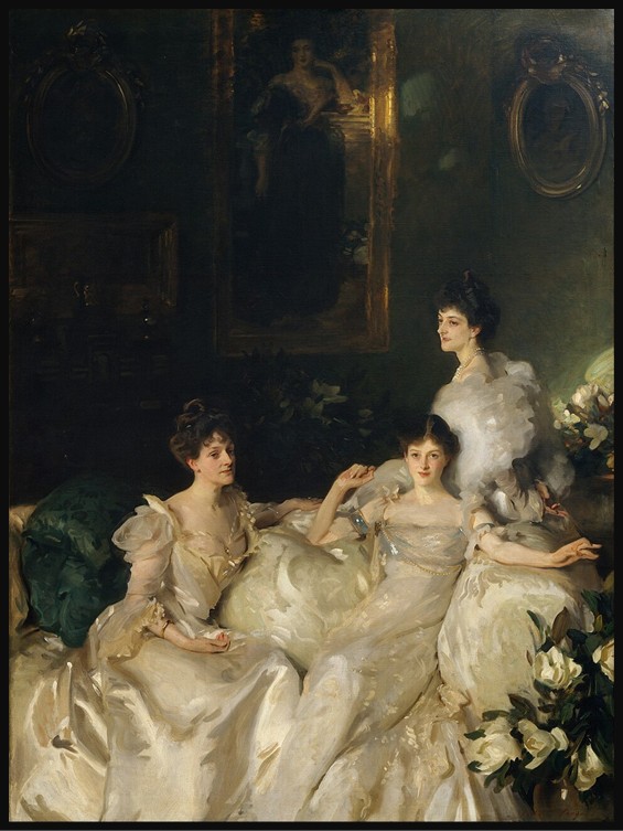
Sargent’s Portrait of the Wyndham Sisters transforms portraiture into a dynamic composition, uniting elegance, movement, and individuality while capturing psychological nuance and the interplay between heritage, identity, and modern femininity.
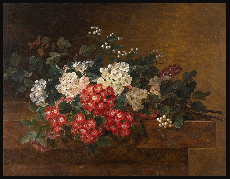
In the quiet refinement of 19th-century Danish painting, Jensen’s Still Life with Hawthorn Blossom celebrates May’s fleeting beauty — where delicate hawthorn blossoms become symbols of renewal, transience, and enduring meaning.

Winslow Homer’s A Mountain Climber Resting captures a quiet summit pause, reflecting rising leisure travel, shifting views of nature, and the enduring ideal of solitary exploration in nineteenth-century America.
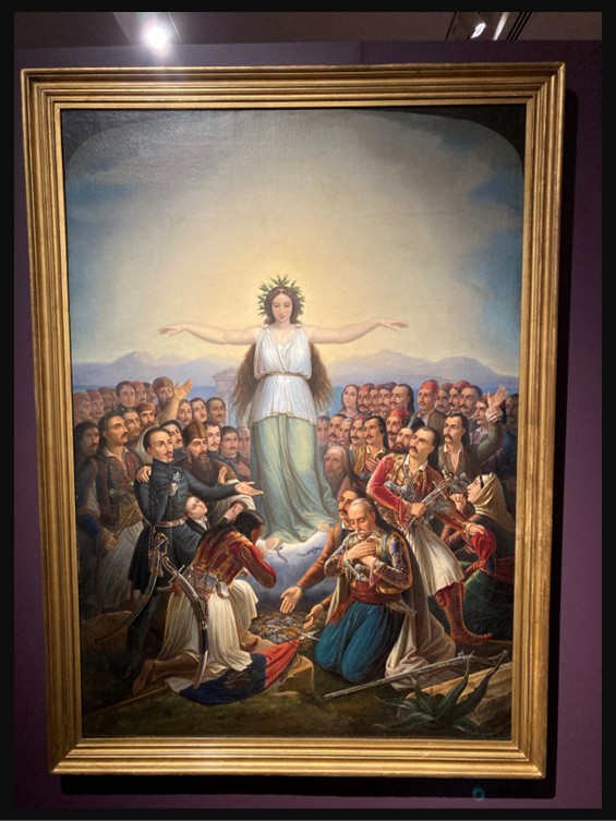
Vryzakis’s 1858 painting unites heroes of the Greek Revolution in an allegorical tribute, where personified Greece honors their collective sacrifice, transforming history into memory, identity, and national gratitude.
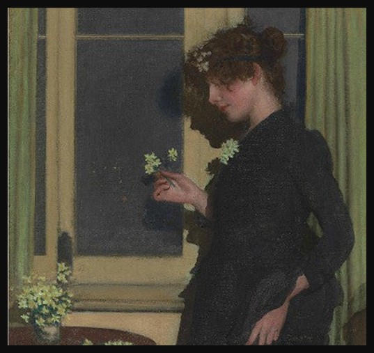
March’s flower arrives quietly in Jonquil, where Philip Wilson Steer captures early spring’s tender renewal through soft light, stillness, and intimate contemplation.
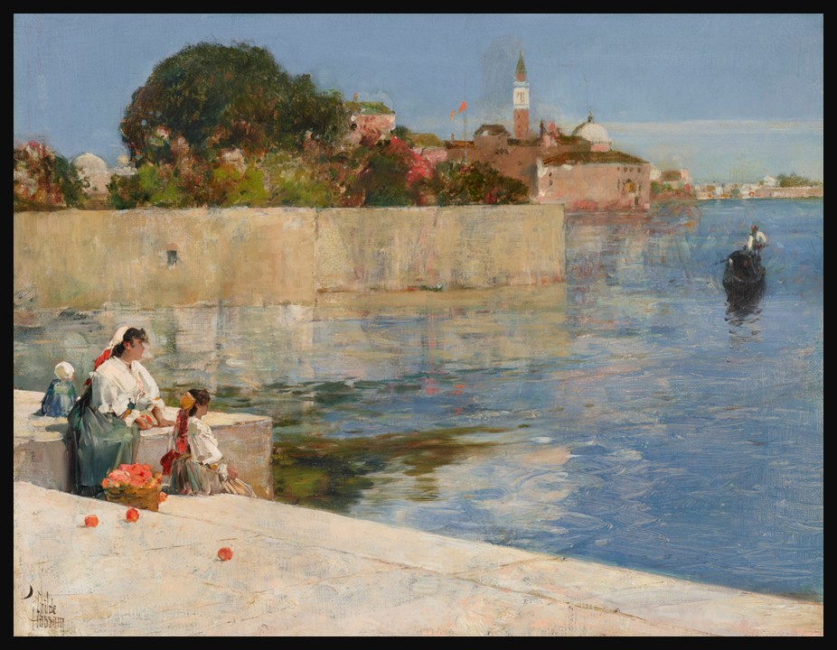
In View of Venice, Childe Hassam captures Venice’s shimmering light and movement, marking the formative moment his evolving style embraced vibrant color and modern Impressionist vision.