Camille Pissarro, a central figure in Impressionism and Neo-Impressionism, pioneered modern landscape painting through his lifelong commitment to capturing rural life, light, and everyday scenes across all eight Impressionist exhibitions.
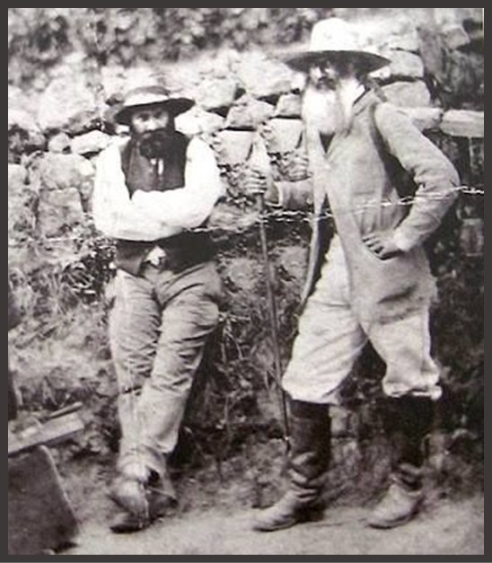
Camille Pissarro, a central figure in Impressionism and Neo-Impressionism, pioneered modern landscape painting through his lifelong commitment to capturing rural life, light, and everyday scenes across all eight Impressionist exhibitions.
Katerina “Rosa” Botsaris, famed for her beauty and noble heritage, became Queen Amalia’s lady-in-waiting and was immortalized by Joseph Karl Stieler in Bavaria’s Gallery of Beauties.
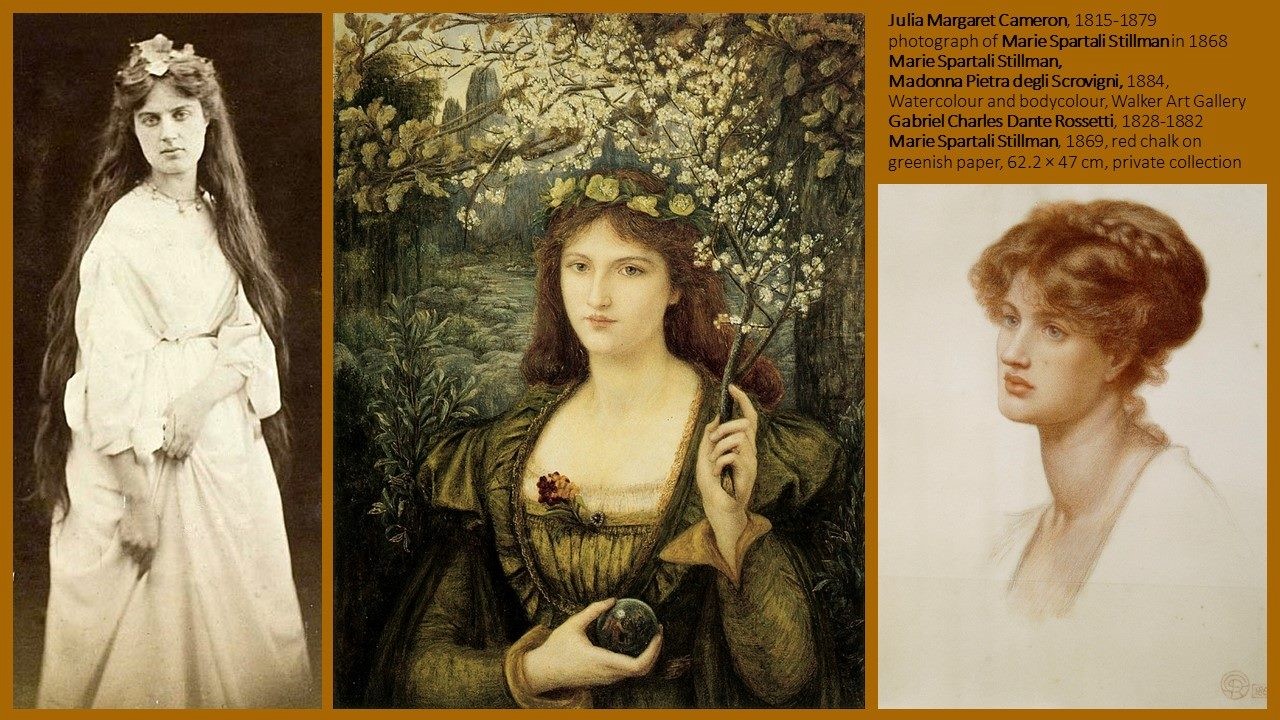
On International Women’s Day, Marie Spartali Stillman, a Pre-Raphaelite artist and celebrated beauty, stands as a symbol of women’s artistic achievement and cultural presence in 19th-century London.
Degas’ Little Dancer Aged Fourteen combines wax, fabric, and real hair over a complex armature, creating a strikingly lifelike sculpture that blurred the boundaries between art, realism, and theatrical illusion.
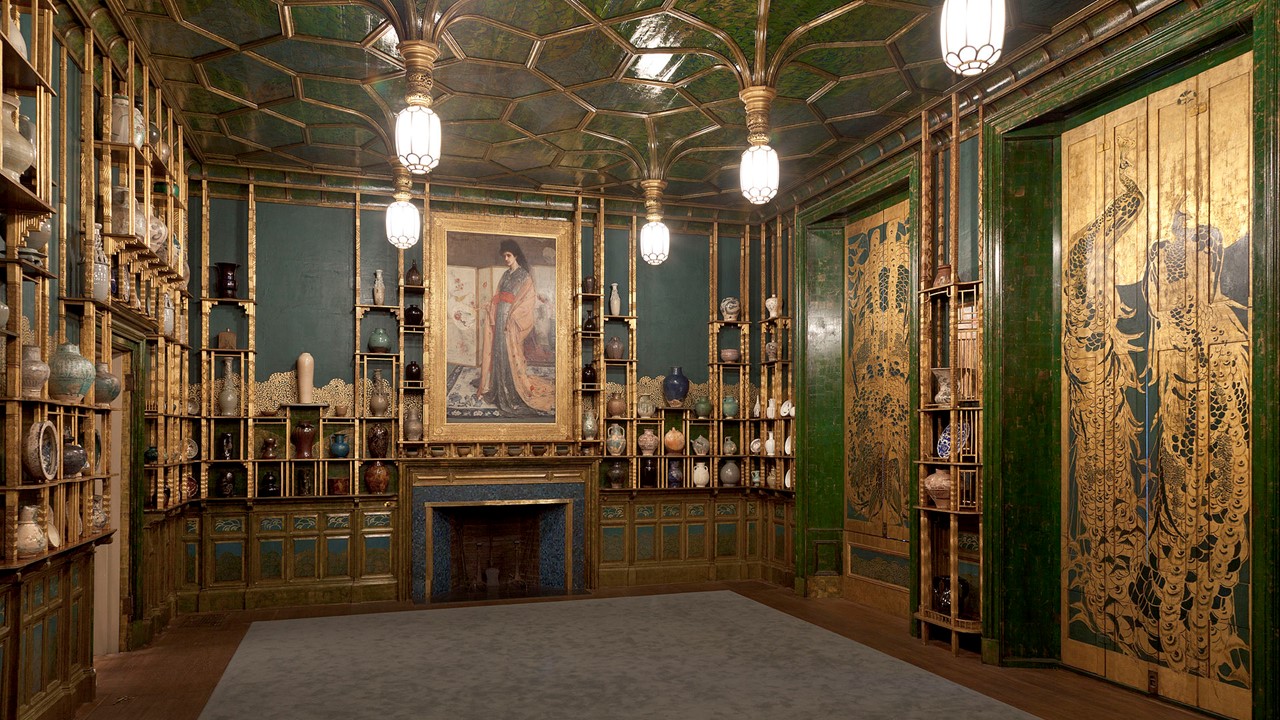
Whistler’s Princess from the Land of Porcelain reimagines Western portraiture through Japanese and Chinese aesthetics, portraying Christina Spartali in exotic costume amid porcelain-inspired decor, blending beauty, fantasy, and cross-cultural artistic influence.
Suzanne Valadon rose from poverty in Montmartre to become a model for major artists and later a pioneering painter, known for bold nudes and powerful, psychologically charged self-portraits and family scenes.
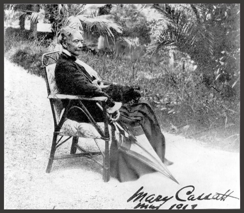
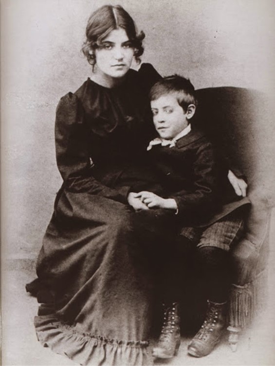
Mary Cassatt’s Five O’Clock Tea (1880) depicts an intimate Parisian domestic ritual, capturing refined bourgeois women at leisure in a modern interior, with subtle Impressionist attention to everyday life and atmosphere.
Camille Pissarro’s Basket of Pears (1872, Pontoise) is a luminous Impressionist still life, evoking rural simplicity and the quiet abundance of fruit through subtle light, color, and balanced composition.
Claude Monet’s The Turkeys (1876) captures a radiant rural scene in which vibrant light, loose brushwork, and asymmetrical composition reflect the Impressionist search for immediacy and atmospheric vitality in everyday nature.
Georgios Iakovidis’ First Steps (c. 1889) tenderly depicts a child learning to walk, using soft light and intimate composition to express familial love, care, and the universal theme of early childhood development.