A reflective Fourth of July exploration of Childe Hassam’s Acorn Street, Boston, July 1919 and its quiet vision of American identity, history, and Impressionist light.
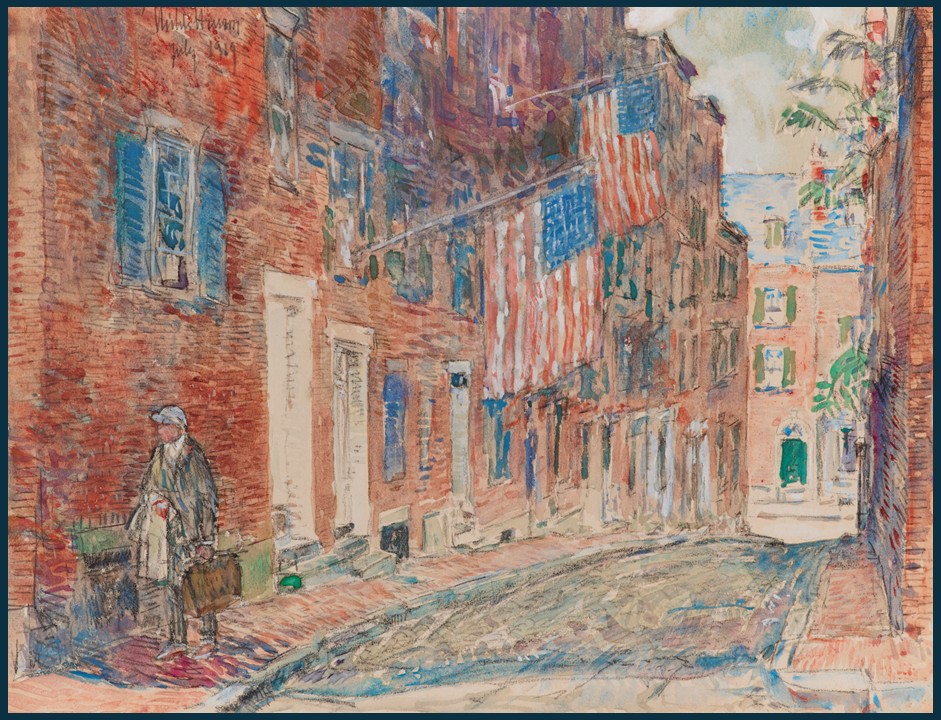
A reflective Fourth of July exploration of Childe Hassam’s Acorn Street, Boston, July 1919 and its quiet vision of American identity, history, and Impressionist light.
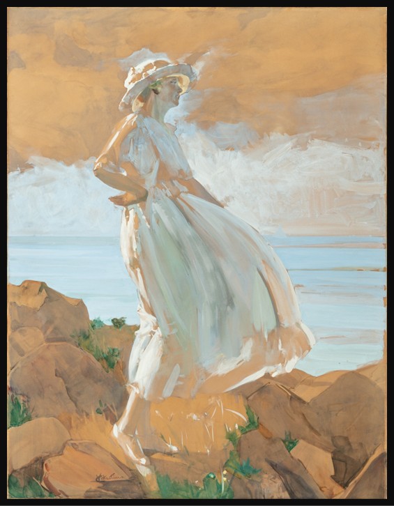
In 1936, at the height of his career, Italian painter Virgilio Costantini captured his wife on a clifftop in a gouache of rare scale, confidence, and tenderness.
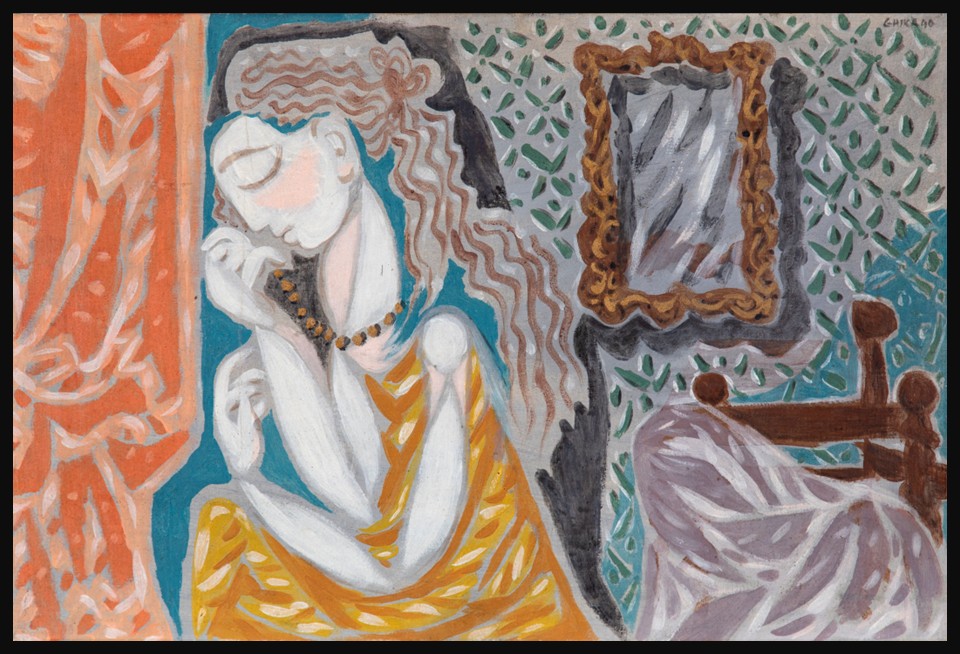
Luminous, stylish, and charged with youthful energy, Ghika’s Interior with Woman and Mirror is a masterclass in creative dialogue. Here’s how a Greek modernist absorbed the lessons of Picasso, and painted something entirely his own.
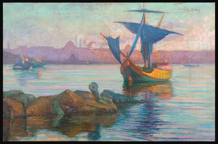
Maleas captures Constantinople at sunset as a luminous, dreamlike city where color, light, and atmosphere dissolve form, transforming architecture and landscape into a poetic meditation on beauty, memory, and cultural convergence.

A luminous close-up by Georgia O’Keeffe transforms sweet peas into an immersive meditation on form, perception, and the quiet power of spring’s fleeting beauty.
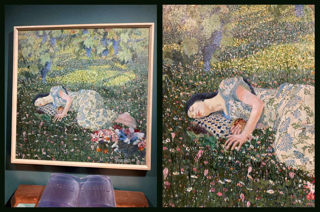
Casorati’s The Dream of the Pomegranate presents a sleeping figure in a flowered meadow, where stillness, symbolism, and dreamlike silence merge into a poetic meditation on interior life.
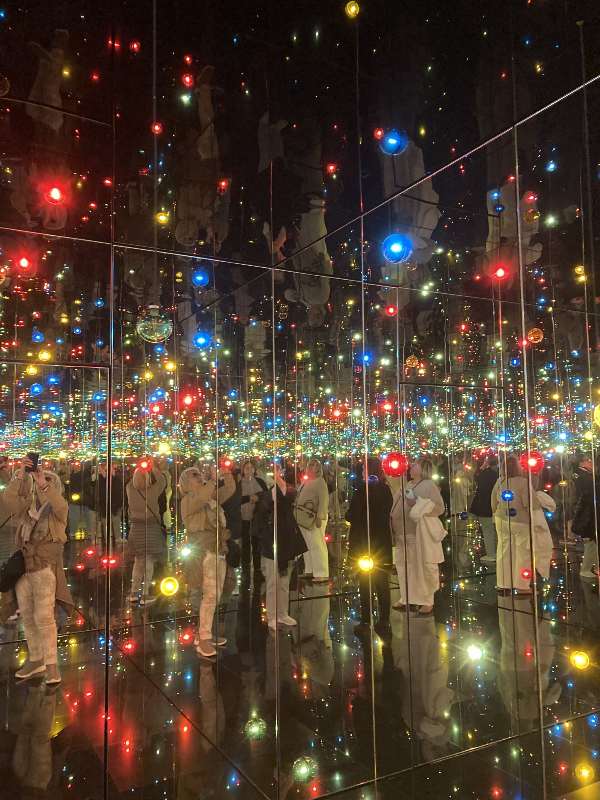
Yayoi Kusama’s Infinity Mirrored Room transforms light and reflection into a meditative experience, dissolving boundaries between self and space, and offering a poetic vision of hope, connection, and renewal.
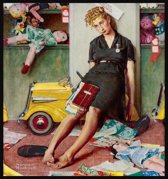
Norman Rockwell’s Tired Salesgirl on Christmas Eve reveals the quiet dignity of unseen labor, transforming a moment of exhaustion into a tender meditation on empathy, perseverance, and the human cost behind holiday celebration.
Walter E. Spradbery’s Holly (1936) is a festive London Underground poster that blends Art Deco design with traditional seasonal symbolism, using bold linocut forms to unite nature, celebration, and modern transport culture.
Doris Lee’s Thanksgiving (1935) captures the warmth of American domestic life during the Great Depression, celebrating community, labor, and shared tradition through a lively, humorous scene that embodies the spirit of the American Scene movement.