Chagall’s magnificent ceiling at the Opéra Garnier

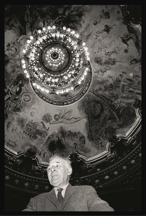
Marc Chagall, from Belarus, 1887-1985
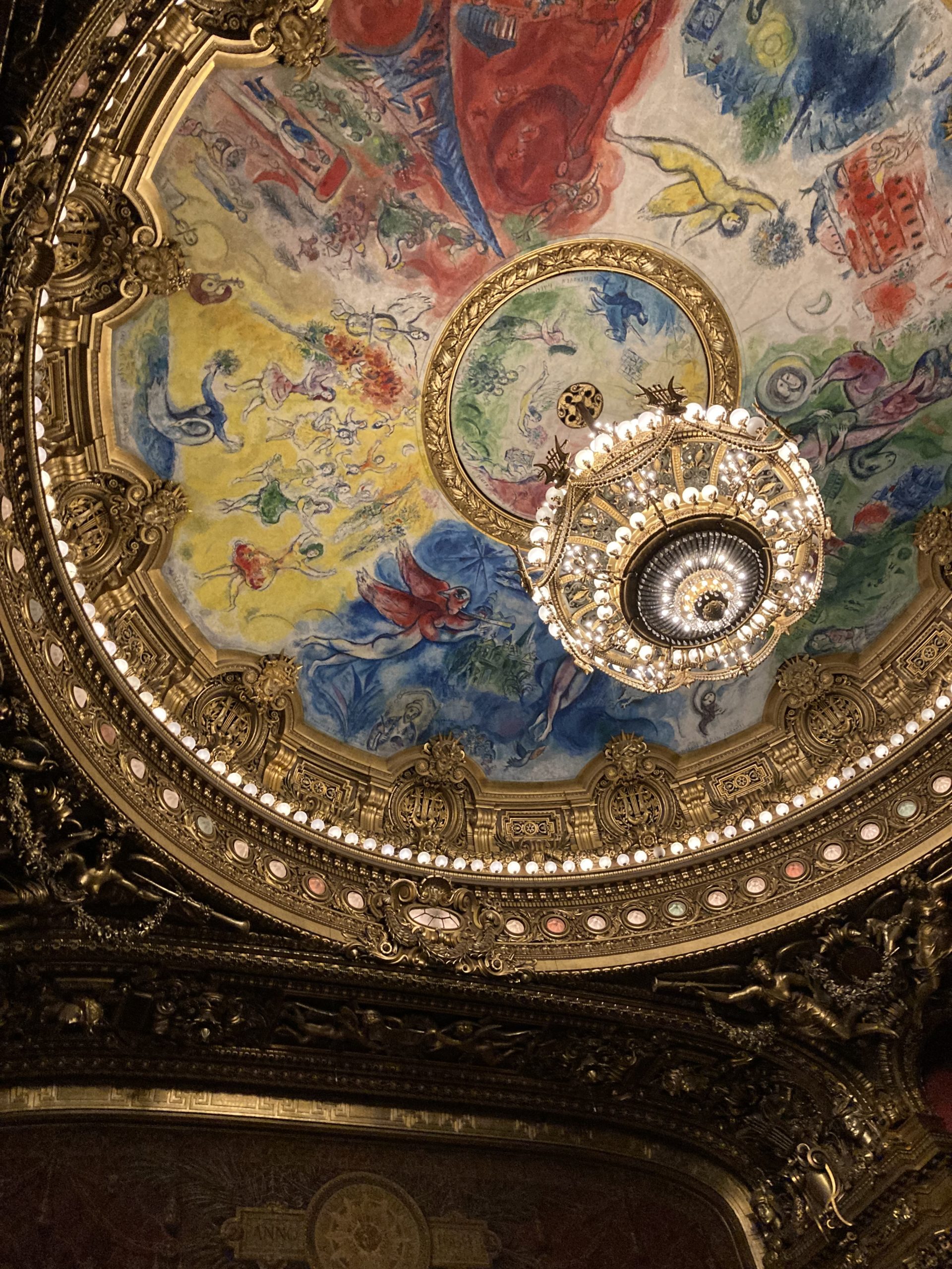
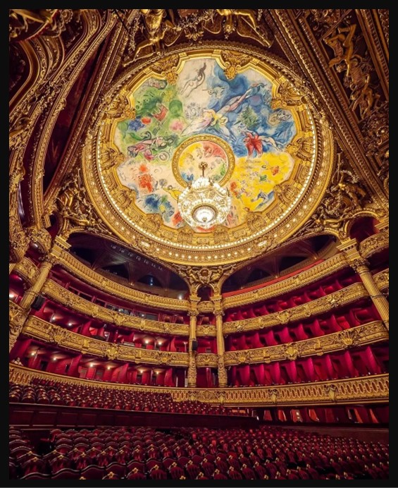
The ceiling of the Opéra Garnier, started in 1963 and completed on the 23rd of September, 1964, nearly 240 m² canvas, Opera Garnier, Paris, France – Photo Credit: Amalia Spiliakou, May 8, 2023

Russian-born artist Marc Chagall once said that “the dignity of the artist lies in his duty of keeping awake the sense of wonder in the world.” And it is difficult to conceal one’s wonder beneath Chagall’s magnificent ceiling at the Opéra Garnier, a masterwork that was unveiled in 1964… This is exactly how I felt on the 8th of May, 2023, attending the Dante Project by Wayne McGregor… WONDER! https://www.architecturaldigest.com/story/marc-chagall-opera-ceiling

Today’s goal is to highlight the artistic significance of the Opera Garnier’s painted Dome, featuring the breathtaking work of renowned painter Marc Chagall.

Chagall’s work at the Opera Garnier in Paris stands as a captivating testament to artistic innovation within the confines of historical grandeur. The vivid colors and imaginative forms of Chagall’s masterpiece create a striking juxtaposition against the backdrop of the Belle Epoque building. As one gazes upon the ornate details and classical elegance of the Opera House, the unexpected burst of modernity and expression on the dome becomes a mesmerizing focal point. This dynamic interplay between tradition and avant-garde artistry enhances the overall aesthetic experience, inviting viewers to appreciate the harmonious coexistence of two distinct yet complementary artistic worlds within the iconic Parisian landmark.

Marc Chagall’s involvement in painting the dome of the Opera Garnier in Paris is a fascinating chapter in the history of both art and architecture. In 1963, French Minister of Culture André Malraux proposed the idea of commissioning a contemporary artist to contribute to the decoration of the historic building. Chagall, renowned for his dreamlike and symbolic works, was chosen for this ambitious project, hoping for this commission to mark a departure from the conventional approach of adorning opera houses with historical or mythological themes. The artist embraced the opportunity to infuse the space with his distinctive blend of colors and imaginative compositions. He embarked on the task with great enthusiasm, creating a 560-square-meter masterpiece that would become one of his largest and most celebrated works.

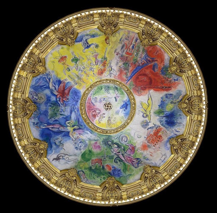
Completed in 1964, Chagall’s painted dome is a visual feast, featuring a rich tapestry of scenes and characters from famous operas. The vibrant hues and dynamic forms evoke a sense of lyricism and movement, encapsulating the essence of the performing arts.

The theme behind Marc Chagall’s painting of the dome of the Opera Garnier is a celebration of the world of music, dance, and the performing arts. Chagall’s approach to the commission was to create a vibrant and whimsical visual narrative that captured the spirit of opera and ballet. The dome serves as a vast canvas for Chagall’s imaginative interpretation of the cultural and emotional resonance found in the world of performing arts, featuring a kaleidoscope of colors, floating figures, and symbolic elements drawn from various operas. Dancers, musicians, and mythical creatures come together in a dreamlike composition, conveying a sense of lyricism and movement. The artist skillfully weaves together scenes and characters from famous operas, creating a harmonious and dynamic tapestry that reflects the magic and drama of the performing arts.

Marc Chagall, from Belarus, 1887-1985
The ceiling of the Opéra Garnier started in 1963 and was completed on the 23rd of September, 1964, nearly 240 m² canvas, Opera Garnier, Paris, France https://www.pariszigzag.fr/insolite/histoire-insolite-paris/lhistoire-du-plafond-de-lopera-garnier-par-marc-chagall

Chagall’s dome at the Opera Garnier received mixed reactions initially, with some critics appreciating the modern approach and others expressing reservations about its departure from tradition. However, over time, the masterpiece has come to be recognized as a pivotal work in the intersection of contemporary art and historic architecture. Today, Chagall’s contribution to the Opera Garnier stands as a testament to the enduring power of artistic expression and the willingness to embrace innovation within venerable cultural institutions. The painted dome continues to enchant visitors, offering a unique and immersive experience that transcends the boundaries of time and tradition.

For a full explanation of what Chagall’s ceiling composition presents, please check Google Arts & Culture… https://artsandculture.google.com/asset/marc-chagall%E2%80%99s-ceiling-for-the-paris-op%C3%A9ra-marc-chagall/RwHNmMsONyvObQ

For a Student Activity, inspired by Chagall’s magnificent ceiling at the Opéra Garnier, please… Check HERE!

Opéra Garnier in Paris filmed by a drone… is an interesting, short, video to watch: https://www.linkedin.com/pulse/marc-chagall-opera-love-never-died-look-paris-op%C3%A9ra-garnier-cruz-1/ 

On Marc Chagall: The artist of the Opera’s dome, Marc Chagall, was of Russian-French origin, known for his unique blend of fantasy, symbolism, and elements of folk art. He was associated with several art movements, including Cubism and Surrealism, but his work defied easy categorization. Chagall’s art often featured dreamlike and poetic scenes, filled with vibrant colors and floating figures. He painted a variety of subjects, including village life, biblical themes, and memories of his hometown Vitebsk. Marc Chagall’s contributions to the art world have left a lasting impact, and he is considered one of the most significant artists of the 20th century.

On the Opera Garnier: Officially known as the Palais Garnier, this is an architectural masterpiece and a cultural icon located in the heart of Paris, France. Designed by Charles Garnier and inaugurated in 1875, the opera house is a splendid example of Beaux-Arts architecture, characterized by its opulent ornamentation, grandiosity, and meticulous attention to detail. The exterior is adorned with sculptures, columns, and a grand staircase, while the interior boasts a lavish auditorium with a stunning chandelier, intricate frescoes, and a ceiling painted by Marc Chagall in the 1960s. The Opera Garnier has been a focal point for Parisian cultural life, hosting a myriad of operas, ballets, and other performances. Its rich history, architectural beauty, and artistic significance make it a symbol of Paris’s enduring cultural legacy.

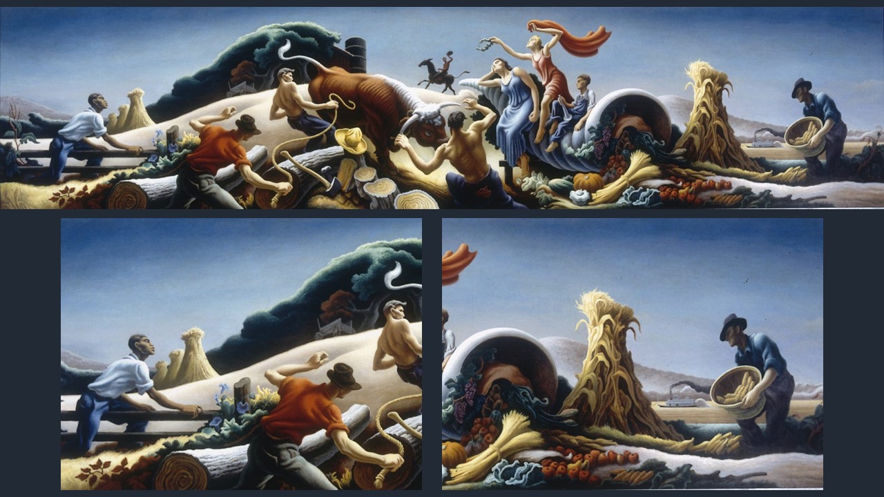
Achelous and Hercules

Thomas Hart Benton, American Artist, 1889-1975
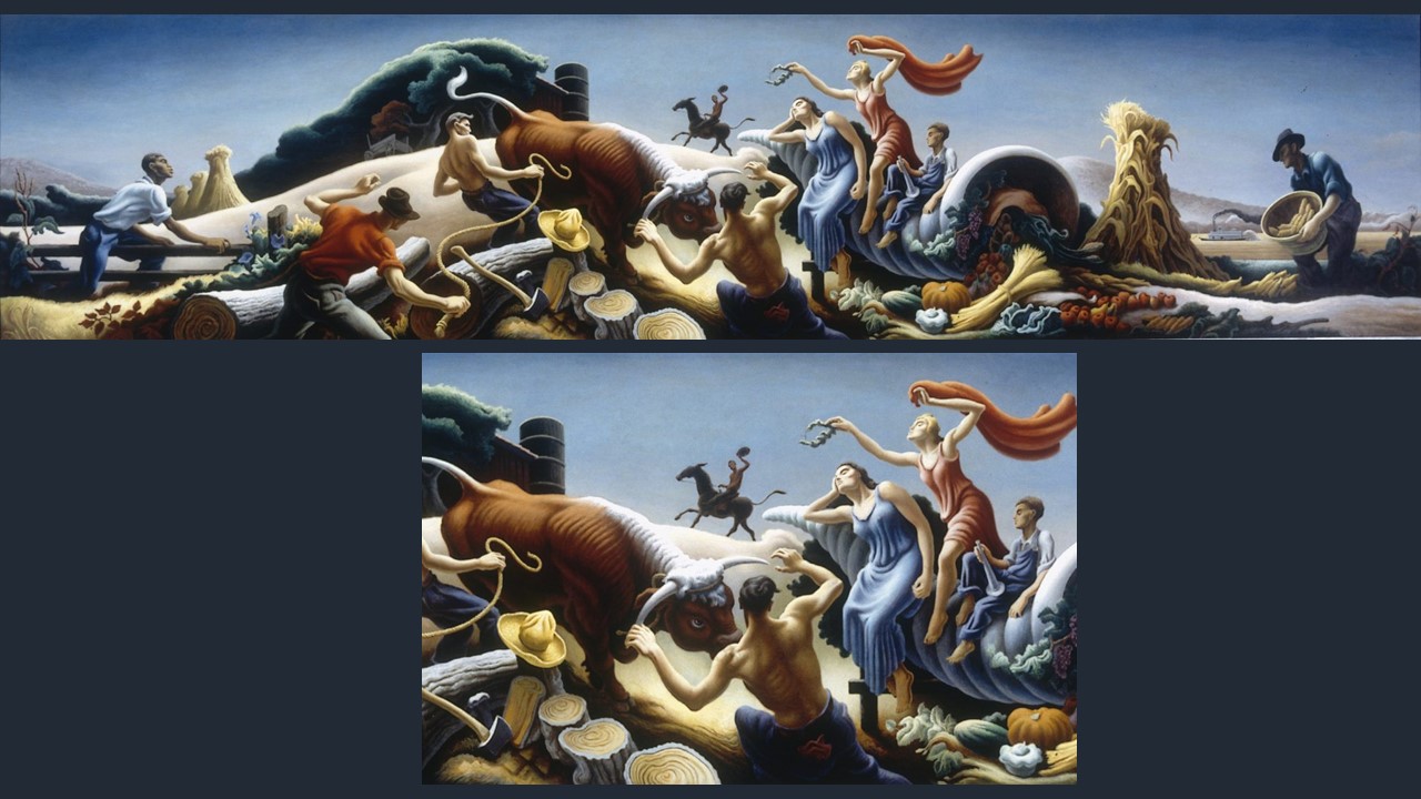
Achelous and Hercules (and detail), 1947, Tempera and Oil on Canvas mounted on plywood, 159.6 x 671.0 cm, Smithsonian American Art Museum, Washington DC, USA https://narrativepainting.net/thomas-hart-benton-achelous-and-hercules-1947/

The myth of the fight between Achelous and Hercules is a captivating tale from Greek mythology. In this legend, Achelous, an ancient Greek river god, transforms into various shapes during his battle with Hercules in an attempt to defeat the hero and win the hand of Deianira, the beautiful Calydonian princess. Despite his shapeshifting abilities, Achelous is ultimately outmatched by Hercules, who manages to break off one of the river god’s horns. This horn becomes the Cornucopia, or the “Horn of Plenty,” symbolizing abundance and nourishment. The myth highlights Hercules’ strength and resourcefulness, as well as the enduring theme of divine contests and transformations in Greek mythology.

Ovid’s narrative in Book 9 of the Metamorphoses provides a detailed account of this myth, including the transformations of Achelous and his fateful battle with Hercules. Who wants to recall the battles he has lost? The great river God tells Theseus, the Athenian hero… But, I will tell it as it happened: since the shame of being beaten is no less than the honour of having fought. It is a great consolation to me that the victor was so famous… Ovid, a prominent Roman poet who lived during the 1st century BC, is known for his retelling of various Greek and Roman myths. He became famous and influential in preserving and popularizing these ancient stories. https://ovid.lib.virginia.edu/trans/Metamorph9.htm#483366540

Thomas Hart Benton, American Artist, 1889-1975
Achelous and Hercules (and details), 1947, Tempera and Oil on Canvas mounted on plywood, 159.6 x 671.0 cm, Smithsonian American Art Museum, Washington DC, USA https://narrativepainting.net/thomas-hart-benton-achelous-and-hercules-1947/

In 1947 American artist Thomas Hart Benton was hired by Lester Siegel Sr., proprietor of Kansas City’s Harzfeld department store, to decorate the wall above the store’s elevator area. Benton settled on a retelling of the Achelous and Hercules myth from ancient Greece, setting it in present-day Missouri. The artist viewed this legend as a parable of his beloved Midwest. The Army Corps of Engineers had begun, at the time, efforts to control the Missouri River, and Benton imagined, and depicted, a future where the waterway was tamed, and the earth swelled with robust harvests. https://ovid.lib.virginia.edu/trans/Metamorph9.htm#483366540 and https://narrativepainting.net/thomas-hart-benton-achelous-and-hercules-1947/

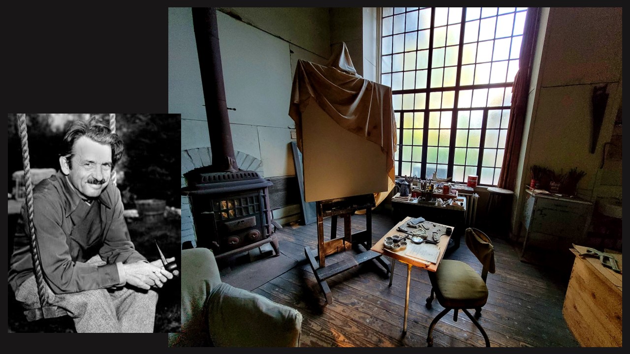
Photo Portrait of Thomas Hart Benton and Photo of his Studio from ‘The OFFICIAL Facebook page for the Thomas Hart Benton Home and Studio State Historic Site in Kansas’ https://www.facebook.com/ThomasHartBentonHomeandStudioSHS

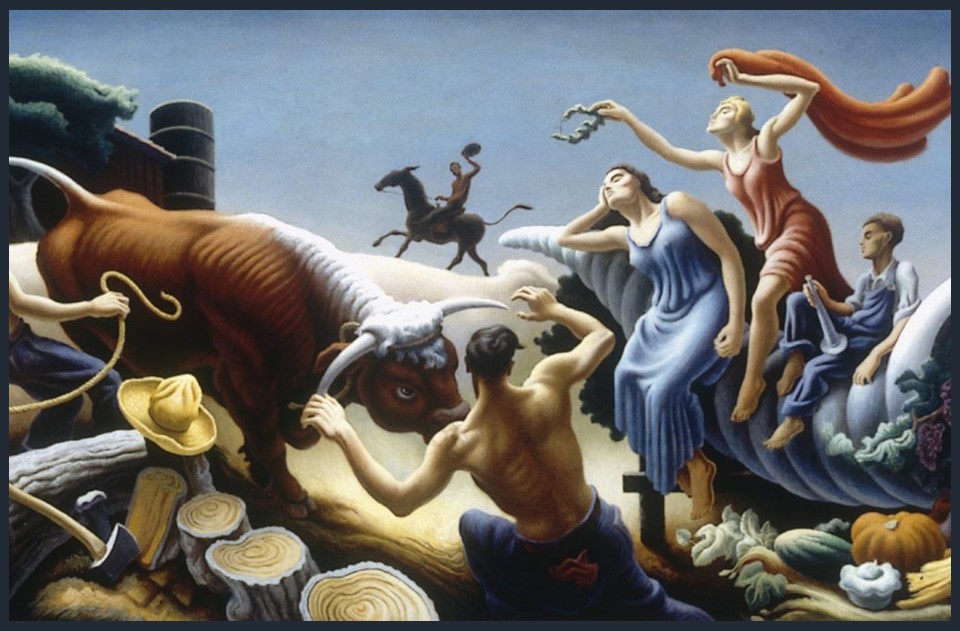
The artwork features a dynamic and muscular Hercules wrestling Achelous, who is depicted as a ferocious bull. Benton’s composition is characterized by bold, exaggerated forms and a strong sense of movement, which is a hallmark of his unique approach to storytelling through art. This painting is a prime example of the artist’s ability to fuse classical themes with the American experience, creating a powerful and visually compelling narrative.

Thomas Hart Benton, American Artist, 1889-1975
Achelous and Hercules (detail), 1947, Tempera and Oil on Canvas mounted on plywood, 159.6 x 671.0 cm, Smithsonian American Art Museum, Washington DC, USA https://narrativepainting.net/thomas-hart-benton-achelous-and-hercules-1947/

In Achelous and Hercules, Benton not only showcases his technical prowess but also his deep appreciation for the human struggle and the mythological underpinnings that resonate with American themes of strength and determination. The painting stands as a testament to Benton’s skill in merging classical and contemporary elements, and it remains a significant piece in the realm of American art history.

Thomas Hart Benton was a prominent American artist known for his contributions to the American Regionalist movement in the early to mid-20th century. Born in Neosho, Missouri, in 1889, Benton’s work is characterized by its celebration of everyday life in rural America. He was a master of capturing the essence of the American heartland through his vivid and dynamic paintings, often depicting scenes of farmers, laborers, and small-town life. Benton’s art not only showcased his exceptional technical skill but also conveyed a deep sense of patriotism and a connection to the working-class people he portrayed. His distinctive style combined elements of European modernism with a uniquely American perspective. Benton’s legacy lives on as his art continues to be celebrated for its evocative storytelling and its role in shaping the American art landscape.

For a PowerPoint on Thomas Hart Benton’s oeuvre, please… Check HERE!

November First

Andrew Wyeth, American Artist, 1917-2009
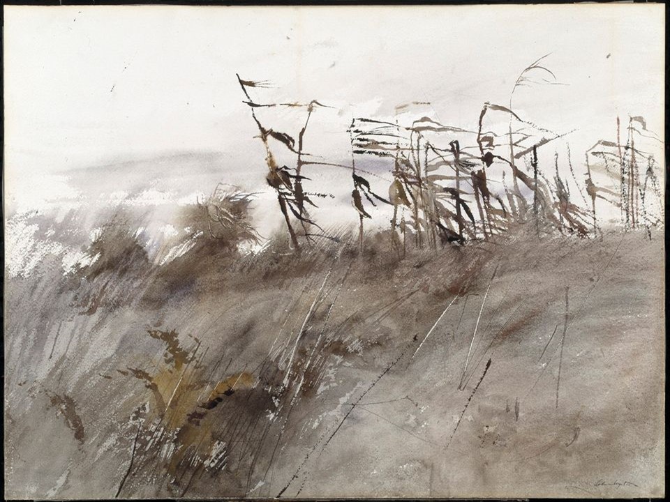
November First, 1950, Watercolour on Paper mounted on Paperboard, 55.2 x 75.4 cm, Smithsonian American Art Museum, Washington DC, USA https://americanart.si.edu/artwork/november-first-32150

Let me quote Andrew Wyeth… I prefer winter and fall, when you feel the bone structure of the landscape – the loneliness of it, the dead feeling of winter. Something awaits beneath it, the whole story doesn’t show… and introduce to you November First, a landscape of loneliness, decay, and renewal. https://www.theartstory.org/artist/wyeth-andrew/

Andrew Wyeth (1917-2009) was a highly acclaimed American artist known for his realistic and detailed paintings, primarily in a style known as American Realism. He was born in Chadds Ford, Pennsylvania, and was the youngest of the five children of the well-known illustrator and artist N.C. Wyeth. He gained widespread recognition for his works that often depicted the rural landscapes and people of Pennsylvania and Maine. He had a deep connection with the natural world, which was reflected in his art. Some of his most famous works include Christina’s World, a haunting and iconic painting depicting a young woman lying in a field, and the Helga Testorf series, which portrayed a German model and became a subject of much interest and controversy.

The artist masterfully captured for example, textures, surfaces, and subtle variations in light and shadow, creating a sense of hyper-realism in his paintings. His work centered around nature, landscapes, and rural scenes showing a deep appreciation for the natural world and often depicting it with great accuracy and sensitivity. He preferred a subdued and muted colour palette, typically using earth tones, greys, and muted greens. This choice of colours and the interplay of light and shadow in his paintings contributed to the quiet and contemplative mood of his works, evoking a sense of isolation, solitude, and introspection, quiet contemplation, and emotional depth. Depicting scenes and characters from rural America, Wyeth managed to capture the essence of American rural life, and portray its beauty, simplicity, and the passing of time.

Wyeth primarily used two main painting techniques, egg tempera and watercolour. Egg tempera involves mixing pigment with a water-soluble binder made from egg yolk, resulting in a luminous and finely detailed surface. Watercolour, on the other hand, allowed for a more fluid and transparent approach.

Created in 1950, November First is a watercolour painting on paper mounted on paperboard. Part of the Smithsonian American Art Museum, Wyeth’s painting depicts tattered cornstalks in a harvested field, and captures the cold damp of late autumn, portraying the inevitable cycles of decay and renewal… The cornfield shown in this watercolor was located near his studio in Chadds Ford, behind the house of Dr. Margaret Handy, the pediatrician who cared for Wyeth’s two children. https://americanart.si.edu/artwork/november-first-32150

Employing a subdued and muted colour palette that resonates with the November scenery, shades of ochre, gray, muted greens, and hints of blue, dramatic contrasts of light and shadow, and a range of brushwork techniques in watercolour, including washes, and drybrush, Wyeth created a painting that evokes the distinct feelings associated with the month of November. His composition is simple yet elegant, focusing on the beauty and essence of the seasonal landscape, emphasizing a sense of quietude, contemplation, and peacefulness often associated with late autumn and winter.

For a PowerPoint presentation, please… Check HERE!

Peter McIntyre’s Paintings of the Battle of Crete

Peter McIntyre, Artist from New Zealand, 1910-1885
The Barge from Crete, 1941, Oils on Canvas, 746 x 635mm, New Zealand Archives.
https://nzhistory.govt.nz/media/photo/the-barge-crete-peter-mcintyre

It began just after dawn on 20 May 1941. Many of the 7700 New Zealand soldiers stationed on Crete were finishing breakfast when hundreds of German transport aircraft – some towing gliders – rumbled in over the Mediterranean island. The air above was suddenly filled with parachutes as thousands of elite German paratroops began to descend from the sky. This was the start of what is known as the Battle for Crete. For 12 dramatic days New Zealanders, British, Australian, and Greek troops, assisted by Cretan civilians, tried to repel a huge airborne assault by the Germans. They almost succeeded. Peter McIntyre’s Paintings of the Battle of Crete provide a visual record of the events and scenes during the Battle of Crete. As an official war artist, McIntyre had the unique opportunity to witness the battle firsthand and capture its moments on canvas. These paintings serve as a historical document that helps us better understand the conditions, landscapes, and experiences of those involved in the battle. https://nzhistory.govt.nz/war/the-battle-for-crete/overview

Peter McIntyre (1910–1995) was a notable New Zealand artist known for his landscapes and depictions of rural scenes. He gained recognition for his ability to capture the natural beauty of New Zealand’s landscapes and the unique qualities of its light. McIntyre was born in Dunedin, New Zealand, and he displayed artistic talent from a young age. He attended the Dunedin School of Art and later studied at the Elam School of Fine Arts in Auckland. His early works were influenced by the Regionalist movement, which aimed to capture the essence of New Zealand’s unique landscapes and culture.

One of McIntyre’s significant accomplishments was his role as an official war artist during World War II. He was attached to the New Zealand Expeditionary Force and documented the experiences of New Zealand forces in various theaters of war, including Crete, North Africa, and Italy. McIntyre’s artistic contributions during this time were significant and provided a visual record of the war and its impact on the troops.

In Crete, McIntyre accompanied New Zealand forces during the Battle of Crete in 1941. He witnessed the intense fighting and documented the events through his paintings. McIntyre’s artwork from Crete captured the rugged terrain, the chaos of battle, and the resilience of the soldiers involved. His paintings conveyed the human side of war and reflected the courage, determination, and sacrifices made by the New Zealand forces.

The Blitz, Canea Crete area defended by New Zealanders, May 1941, Oils, 625 x 740mm, Archives New Zealand https://www.archives.govt.nz/images/the-blitz-canea-crete-area-defended-by-nz-ers-new-zealanders-may-1941

 McIntyre’s artistic interpretation of the battle brings a unique perspective to the historical narrative. His choices in composition, lighting, and focal points add an artistic layer to the historical record, encouraging viewers to engage with the events on both an intellectual and emotional level.
 
My favorite McIntyre painting of the Battle for Crete is titled The Barge from Crete! It illustrates, according to the New Zealand History Archives experts, the epic journey of a group of escapees who sailed an abandoned landing barge from Crete to Egypt. The 137-strong party, mostly Royal Marines, set out on 1 June. Nine New Zealanders were thought to be among this party, although the only one known by name was Private W.A. Hancox. He had been picked up 3 km offshore, paddling along on a plank of wood. https://nzhistory.govt.nz/media/photo/the-barge-crete-peter-mcintyre

After the barge’s fuel ran out blankets were rigged as sails. To make sure these caught the breeze the men often had to jump into the water and push the nose of the barge in the right direction. Conditions on board were tough. Food supplies were rationed to half a tobacco tin of water and a teaspoon of bully beef per day. During the voyage, one soldier died of exhaustion, and another committed suicide. On 9 June, eight days after leaving Crete, the barge drifted ashore 24 km west of Sidi Barrani in Egypt. https://nzhistory.govt.nz/media/photo/the-barge-crete-peter-mcintyre

Peter McIntyre’s paintings of the Battle of Crete are important as they combine historical documentation, personal perspective, emotional impact, artistic interpretation, and cultural memory. They help us remember, learn from, and emotionally engage with this significant moment in history.

For a PowerPoint of Peter McIntyre’s Paintings of the Battle of Crete, please… Check HERE!

The Dance by Matisse at the Barnes Foundation

Henri Matisse, French Artist, 1869 – 1954
The Dance (view of the Main Room, South Wall), Summer 1932 – April 1933, Oil on canvas; three panels, Overall (left): 339.7 x 441.3 cm, Overall (center): 355.9 x 503.2 cm, Overall (right): 338.8 x 439.4 cm, the Barnes, Philadelphia, PA, USA https://collection.barnesfoundation.org/objects/6967/The-Dance/ensemble

My new BLOG POST titled The Dance by Matisse at the Barnes Foundation starts by quoting Professor Yve-Alain Bois, how Matisse himself describes, on two separate accounts, the moment at which he began work on the Barnes Dance composition and the immensity of the surface he had to master or as he phrased it ‘to possess’…. In the first version, it is an architectural rhyme that triggers the onset of this sense of possession: ‘ As I was pacing in front of my seventy-two square meters of white canvas destined to become the decoration of Doctor Barnes, not knowing which way to start, I noticed by chance a rope hanging from a window to a random spot in my studio, standing out and projecting a curve on my canvas. I suddenly had before me the relationship of this curve to the great rectangle of the edges of my decoration.

Unidentified Photographer
Henri Matisse using a bamboo stick to sketch The Dance in his studio in Nice, 1931, Photograph Collection, Barnes Foundation Archives, Philadelphia
https://www.ias.edu/ideas/2016/bois-matisse-barnes

The second documented account, once more quoting Professor Yve-Alain Bois, of what kicked off Matisse’s sense of taking possession, of the immensity of the space he had to cover, is perhaps more surprising than the first… ‘Faced with my huge white canvases, Matisse wrote, I took a model and began a study that had nothing to do with the decoration. At each of the model’s breaks, I relaxed by looking at these great surfaces, absentmindedly—or so I thought. Then, at a certain point, there came a flash of inspiration. I took my big charcoal, attached it to the end of a big bamboo, and began drawing the circle of my dancers, from one end to the other of my thirteen-meter surface. I’d got off the mark, taken possession of my surface entirely through the power of my imagination. That’s how I made my painting: entirely from feeling, without a model.’

It was the 27th of September, 1930, when Matisse, while touring the United States by train, made a detour to the Barnes Foundation because it housed a significant number of his artworks. He was a man in trouble… I have made several attempts to paint, he wrote to his daughter, Marguerite, in 1929, but when faced with the canvas, I find myself devoid of inspiration… The once-upon-a-time enfant terrible experienced a disheartening period of creative stagnation.

The artist was 60 years old, and lived in Nice, for the past thirteen years. Employing vibrant patterns and radiant colors illuminated by the Mediterranean light, he found himself falling into a repetitive style, capturing captivating female models within the confines of his studio. By 1927, certain critics questioned whether this once-radical artist had lost his innovative spark. They were wondering whether the aging painter of the odalisques was the man André Breton described as ‘a discouraging and discouraged old lion’.

Back in Philadelphia, in September of 1930, visiting the Barnes Foundation, and talking with its founder and owner, Dr. Albert Barnes, Matisse’s creativity ‘issue’ was put to test… According to Cynthia Carolan, a docent at the Barnes Foundation, Dr. Barnes approached the aging painter, engaged him in a gentle critique of his Nice paintings, and acknowledged their sensuous and captivating nature, but suggested they lacked the weightiness of his earlier works. Then, the collector extended an invitation to Matisse, offering him a commission to create a painting that would suit the lunettes, the grand arches above the windows, on the southeast wall of his newly established gallery.

It was a challenge Matisse could not refuse. It would be the only commissioned artwork within the Barnes collection, created specifically for an architectural area of the building. It was a ‘grand’ project as he was expected to create a ‘mural’ in a space that spanned a width of approximately 13.7 meters. It would consist of three distinct canvases, with borders that would converge. Barnes gave Matisse free rein in the choice of subject matter; the agreement simply specified the size of the mural and its place on the southeast wall of the Main Gallery. For Matisse, who had never created anything this large, it was a new beginning!

Henri Matisse, French Artist, 1869 – 1954
The Dance, Summer 1932 – April 1933, Oil on canvas; three panels, Overall (left): 339.7 x 441.3 cm, Overall (center): 355.9 x 503.2 cm, Overall (right): 338.8 x 439.4 cm, the Barnes, Philadelphia, PA, USA https://collection.barnesfoundation.org/objects/6967/The-Dance/

Matisse soon chose the subject of The Dance to embellish the three arches that extended above the French windows. The motif represented an expression of vitality and rejuvenation, a theme that had preoccupied him since he was inspired by the sight of the Catalan fishermen dancing the sardaña on the beach at Collioure in the summer of 1905. He rented the space of an old garage, big enough to work on the outsized canvases, turned to his 1909 and 1910 paintings of Dance 1 and Dance II for inspiration… and started facing the challenges!

Henri Matisse, French Artist, 1869 – 1954
Study for Barnes Mural, Ocher Harmony, 1930–31, oil on canvas, 22×88 cm, Musée Matisse Nice, France
https://philamuseum.org/calendar/exhibition/matisse-1930s

‘Possessing’ the magnitude of the space he had to cover was his biggest challenge. Designing his dancers with correct proportions for the architectural space they would ‘inhabit’ was another one. Using large zones of flat colors that resist the typical illusion of depth and invite the Foundation’s viewers to gentle contemplation was yet, another.

Matisse experimented for a whole year… By using a long bamboo pole attached to a pencil as an elongated drawing device to sketch the dancers’ shapes, Matisse invented a new drawing tool. By cutting large pieces of pre-coloured paper and pinning them up, he solved the problem he faced of setting the piece’s correct proportions. For the first time, Matisse used scissors as an art tool, ushering in the age of his renowned cut-outs. He also began using a camera to document his process so he could compare changes from day to day.

The Dance in Philadelphia, at the Barnes Foundation, marked a return to a modernist style, ultimately creating a dynamic composition depicting bodies that seem to jump across abstracted spaces of pink and blue fields. Matisse struggled and changed the course of action many times, but in the end, ever so innovative, reached his goal and reclaimed his position as a leading figure in the tradition of decorative mural painting… to do it publicly and on a grand scale.

For a PowerPoint on the theme of Matisse and Dance, please… Check HERE!

Bibliography: https://www.ias.edu/ideas/2016/bois-matisse-barnes and https://www.bbc.com/culture/article/20230118-matisses-the-dance-the-masterpiece-that-changed-history and https://collection.barnesfoundation.org/objects/6967/The-Dance/

Warhol by Basquiat Basquiat by Warhol

Jean-Michel Basquiat, American Artist, 1960-1988
Dos Cabezas, October 4, 1962, acrylic and oil stick piece created on canvas and mounted on wood supports, 151.8  × 154 cm, Private Collection
Andy Warhol, American Artist, 1928-1987
Self-Portrait with Jean-Michel Basquiat, October 4, 1962, Polaroid, Collection Bischofberger, Männedor-Zurich, Switzerland
(Photos: Amalia Spiliakou, May of 2023, Exhibition Basquiat × Warhol. À Quatre Mains, Fondation Louis Vuitton)

On the 8th of May, while in Paris, I visited the Exhibition Basquiat × Warhol. À Quatre Mains (From 05.04.2023 to 28.08.2023) at Fondation Louis Vuitton. Two Portraits of the famous duo, the first a Polaroid Photo of the two artists by Andy Warhol, the other, a painted version of the Warhol Polaroid by Basquiat, were the first steps taken towards an artistic collaboration that started on the 4th of October 1982 and resulted in about 160 paintings. My new BLOG POST titled Warhol by Basquiat Basquiat by Warhol will present you with the first impressions of the legendary first meeting of the two artists, organized by Swiss Gallery owner Bruno Bischofberger, as documented by the protagonists.

At Fondation Louis Vuitton for the Basquiat x Warhol, À Quatre Mains Exhibition… (Photo Credit: Katerina Floran-Ioannou)

Down to meet Bruno Bischofberger (cab $7.50). He brought Jean-Michel Basquiat with him. He’s the kid who used the name ‘Samo’ when he used to sit on the sidewalk in Greenwich Village and paint T-shirts, and I’d give him $10 here and there and send him up to Serendipity to try to sell the T-shirts there. He was just one of those kids who drove me crazy… And so had lunch for them and then I took a Polaroid and he went home and within two hours a painting was back, still wet, of him and me together. And I mean, just getting to Christie Street must have taken an hour” (A. Warhol, ‘October 4, 1982″, The Andy Warhol Diaries, ed. P. Hackett, New York, 1989, p. 462).… Warhol wrote in his Diary.

Andy Warhol’s diary entry provides a glimpse into his interaction with Jean-Michel Basquiat, highlighting the first dynamics of their relationship and capturing the essence of their future artistic connection. Warhol’s introduction to the meeting sets the tone for the casual and straightforward nature of the rest of the entry. Jean-Michel Basquiat, mentioned as the kid who used the name ‘Samo’  is significant. The reference to Warhol providing Basquiat with occasional financial support and sending him to sell his T-shirts at Serendipity adds a layer of mentorship or support that Warhol extended to the young artist. Warhol’s remark about Basquiat driving him crazy, however, hints at the upcoming complexities of their relationship. It suggests that Basquiat may have been a somewhat challenging individual to handle, but it’s also possible that Warhol found him intriguing or enigmatic in some way. The diary entry captures a sense of Warhol’s enduring fascination with unique and unconventional characters.

Andy Warhol, American Artist, 1928-1987
Self-Portrait with Jean-Michel Basquiat, October 4, 1962, Polaroid, Collection Bischofberger, Männedor-Zurich, Switzerland (Photo: Amalia Spiliakou, May of 2023, Fondation Louis Vuitton)
Jean-Michel Basquiat, American Artist, 1960-1988
Dos Cabezas, October 4, 1962, acrylic and oil stick piece created on canvas and mounted on wood supports, 151.8  × 154 cm, Private Collection (Photo: Amalia Spiliakou, May of 2023, Fondation Louis Vuitton)

The mention of lunch together highlights the casual nature of their encounter. It’s noteworthy that Warhol took a Polaroid photograph of himself and Basquiat, capturing the moment of their meeting. The fact that Basquiat promptly painted a portrait of both of them, which Warhol describes as still wet, demonstrates Basquiat’s creative energy and immediate response to the encounter.

Overall, Andy Warhol’s diary entry provides a glimpse into his interaction with Jean-Michel Basquiat, highlighting the dynamics of their relationship and capturing the essence of their artistic connection. It showcases Warhol’s role as a mentor and the impact he had on Basquiat’s early career, while also revealing the complexities and idiosyncrasies of their shared artistic world.

Responsible for organizing the meeting between the two artists was Bruno Bischofberger, the Swiss gallery owner, who, at the time, represented both Andy Warhol and Jean-Michel Basquiat. His recollection of the Warhol-Basquiat first meeting expands upon the diary entry by providing additional details and emphasizing the creative exchange between the two artists. It portrays a sense of mutual artistic admiration and the vibrant energy that surrounded their interaction, further enriching our understanding of this significant moment in art history.

Warhol photographed Basquiat with his special Polaroid portrait camera. Jean-Michel asked Warhol whether he could also take a photo of him, took some shots, and then asked me to take some photos of him and Warhol together. We then wanted to go next door to have the customary cold buffet lunch. Basquiat did not want to stay and said goodbye. We had hardly finished lunch, one, at most one and half an hour later, when Basquiat’s assistant appeared with a 150 x 150 cm (60″ x 60″) work on canvas, still completely wet, a double portrait depicting Warhol and Basquiat: Andy on the left in his typical pose resting his chin on his hand, and Basquiat on the right with the wild hair that he had at the time. The painting was titled Dos Cabezas. The assistant had run the ten to fifteen blocks from Basquiat’s studio on Crosby Street to the Factory on Union Square with the painting in his hands because it wouldn’t fit into a taxi. This is how Bischofberger, who facilitated the meeting, recalled the events that led to the famous artworks!

For a Student Activity, please… Check HERE!

Valuable Information for my BLOG POST came from… https://www.christies.com/lot/lot-5371726/?intObjectID=5371726

For Information and two short Videos on the Exhibition at Fondation Louis Vuitton, please… Check… Basquiat × Warhol. Painting four hands (fondationlouisvuitton.fr)

Swimmers on a Wooden Pier

Michael Axelos, Greek Artist, 1877-1965
Swimmers at Palaio Faliro beach, 1935, Oil on plywood, 24.5 x 35.2 cm, Bank of Greece, Athens, Greece
https://www.bankofgreece.gr/PublishingImages/PRESS-RELEASES/2022/Thalassografies_4.jpg.jpg
George Wesley Bellows, American Artist, 1882 – 1925
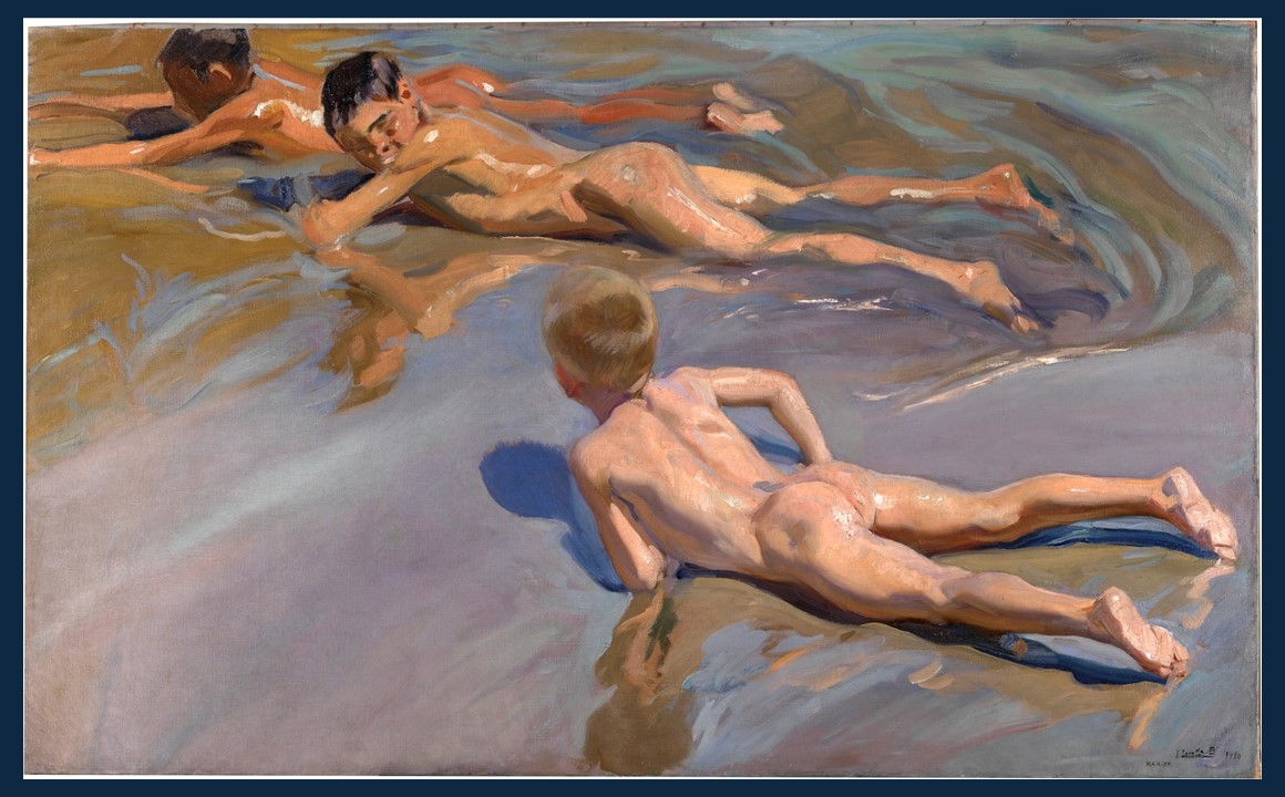
42 Kids, 1907. Oil on canvas, 106.7 x 152.4 cm, Corcoran Gallery of Art, Washington, DC https://www.nga.gov/collection/art-object-page.134485.html

Michael Axelos’s painting oeuvre attests to his solid technique and undeniable talent. It was not by chance, writes Yannis Stournaras, Governor of the Bank of Greece, that he was the first Greek artist to be entrusted, initially by the National Bank of Greece and subsequently by the Bank of Greece, with the design of banknotes and coins, which he imbued with an aesthetic quality. The Exhibition Michael Axelos (1877-1965) – Between two worlds (December 22, 2015 – July 6, 2017), organized by the Bank of Greece – Centre for Culture, Research, and Documentation, shed new light on both known and unknown aspects of the artist’s life. Going through the Exhibition Catalogue, the painting Swimmers at Palaio Faliro Beach caught my attention, and curiosity… how different, or similar, is the Greek artist’s painting compared to George Wesley Bellows composition 42 Kids? A new BLOG POST, Swimmers on a Wooden Pier, will not give you the decisive answer. Maybe information to reflect upon…    https://www.bankofgreece.gr/MediaAttachments/AXELOS_CATALOGUE.pdf

Michael Axelos, an artist of exceptional skill, whose significant output spanned different genres, was a graduate of the Athens Law School and of the Athens School of Fine Arts. From 1911 to 1914 he continued his studies in Paris, at the Académie Julian and the Académie de la Grande Chaumière where his rather conservative initial training was infused with the new artistic developments, on one hand, Fauvism, and on the other hand Cubism, as presented in the Salons of 1910 and 1911. Axelos devoted a large part of his life and work to the Bank of Greece, where he designed banknotes, coins, and security documents. His retirement in 1846 starts a new period in his artistic life. Without changing his style radically, his painting becomes somehow liberated, is less strict, and escapes from the conservative framework where he had consciously placed it. https://museum.bankofgreece.gr/en/exhibitions/5/–18771965—–?ctx=9b1ea4a74a6d7c70df84ae52cbab3c959873d6f8&idx=4

Michael Axelos, Greek Artist, 1877-1965
Swimmers at Palaio Faliro beach, 1935, Oil on plywood, 24.5 x 35.2 cm, Bank of Greece, Athens, Greece
https://www.bankofgreece.gr/PublishingImages/PRESS-RELEASES/2022/Thalassografies_4.jpg.jpg

In 1935, while still working for the Bank of Greece, Axelos painted Swimmers at Palaio Faliro beach, one of my favorite, most charming paintings. Palaio Faliro is a coastal suburb of Athens and a popular destination for beachgoers. Axelos’ painting depicts a group of swimmers, with the blue sky, the sea, and the not-so-distant Athenian coast, forming a prominent part of the composition. The swimmers are portrayed in a gestural and loose manner, emphasizing movement and dynamism. They take advantage of the well-constructed wooden piers and enjoy a typical Greek summer day, diving into the sea, splashing with joy in the water, and sunbathing. Axelos’ use of tints and little shade, expressive brushstrokes, and direct sunlight, creates a delightful, persuasive composition of a classic Greek summer morning.

George Wesley Bellows was an American artist known for his depictions of New York City life. He was born in Columbus, Ohio, and studied at the Ohio State University before moving to New York City in 1904 to study at the New York School of Art under Robert Henri. Bellows quickly became known for his bold and expressive style, which captured the energy and dynamism of the city. His early work focused on the working-class neighborhoods of New York, depicting scenes of tenement life, street vendors, and labor strikes. He was a member of the Ashcan School, a group of artists who sought to depict the realities of modern life in their work. Tragically, Bellows died at the age of 42 from a ruptured appendix. Despite his short career, he left a lasting impact on American art and is considered one of the most important artists of the early 20th century.

George Wesley Bellows, American Artist, 1882 – 1925
Forty Two Kids, 1907. Oil on canvas, 106.7 x 152.4 cm, Corcoran Gallery of Art, Washington, DC https://www.nga.gov/collection/art-object-page.134485.html

In August 1907 Bellows painted Forty-Two Kids, which depicts a band of nude and partially clothed boys engaged in a variety of antics—swimming, diving, sunbathing, smoking, and possibly urinating—on and near a dilapidated wharf jutting out over New York City’s East River. https://www.nga.gov/collection/art-object-page.134485.html

In terms of aesthetics, Bellows has used bold brushstrokes and vibrant colors to capture the energy and excitement of the children. The figures are depicted in dynamic poses that convey their movement and joy. The composition is carefully balanced, with the rough wooden pier stretching out to the right of the canvas, and the water and sky occupying the upper two-thirds of the painting. The use of color is particularly striking in this painting. The boys’ gangly bodies are loosely painted and brightly lit from the upper left. Most are nude, and Bellows employs hues of bright, cream white to medium brown to capture their skin tones. For the rest of the painting, the river in particular, Bellows uses intense shades of blue, emerald green, and yellow that convey a sense of summertime and warmth. The reflections of the children in the water create a sense of depth and perspective, and the overall effect is one of a moment frozen in time, capturing the exuberance of roaming young boys from New York’s Lower East Side tenements. https://www.nga.gov/collection/art-object-page.134485.html

Do you see similarities or differences? The decision is yours…

For a Student Activity, titled Swimmers on a Wooden Pier, please… Check HERE!

The Fourth of July 1916

Childe Hassam, American Artist, 1859-1935
The Fourth of July 1916, 1916, oil on canvas, 91.4 x 66.7 cm, New York Historical Society, USA https://commons.wikimedia.org/wiki/File:The_Fourth_of_July,_1916_Childe_Hassam.jpg

A glorious sea of American flags, crowded streets, and Fifth Avenue skyscrapers, The Fourth of July 1916 (The Greatest Display of the American Flag Ever Seen in New York, Climax of the Preparedness Parade in May) by Childe Hassam (1859-1935) is a beloved work of American Impressionism. It was painted at the height of Hassam’s powers and is one of some 30 related paintings of flag-decorated streets that the artist produced between 1916 and 1919, during and immediately after the First World War. That they are intensely patriotic works is patent, while aesthetically they bear witness to the example of Claude Monet, both in the subject (Monet created two paintings of flag-bedecked avenues on a single day in 1878) and in the concept (a series of paintings of a motif, such as haystacks or Rouen Cathedral). https://www.nyhistory.org/exhibitions/fourth-july-1916 and https://www.whitehousehistory.org/photos/treasures-of-the-white-house-avenue-in-the-rain

Childe Hassam (1859-1935) was an American Impressionist painter known for his depictions of urban landscapes, cityscapes, and seascapes. He was born Frederick Childe Hassam in Dorchester, Massachusetts, and grew up in a middle-class family. Hassam showed an early interest in art and studied at the Boston Art Club and the Lowell Institute. He worked as an apprentice in a wood engraving firm and began his career as a freelance illustrator, creating illustrations for magazines and newspapers. In the spring of 1886, along with his wife Kathleen Maude Doane, he traveled to Paris to study painting at the Académie Julian. While in Paris, Hassam was greatly influenced by the Impressionist movement, which was then emerging in France. He was particularly drawn to the work of Claude Monet and the French Impressionists, and he began to incorporate their techniques into his own work. He returned to the United States in 1889 and recognizing the prominence of New York as an international art center, he settled in New York City, where he established himself as a leading American Impressionist painter. https://www.nga.gov/collection/artist-info.1379.html

Throughout his career, Hassam painted a wide range of subjects, including landscapes, cityscapes, seascapes, and portraits. He was especially known for his depictions of urban life in New York City, and his paintings capture the energy and vibrancy of the city. Hassam was also deeply patriotic and painted many works featuring the American flag, which he saw as a symbol of national unity and identity. https://www.nga.gov/collection/artist-info.1379.html

As a prominent member of the US Preparedness Movement, Hassam created a series of paintings known as the Flag Series, which featured American flags prominently displayed in various settings, including urban landscapes and rural scenes. These paintings were seen as a way of promoting patriotism and support for the US Preparedness Movement.

Childe Hassam, American Artist, 1859-1935
The Fourth of July 1916 (detail), 1916, oil on canvas, 91.4 x 66.7 cm, New York Historical Society, USA
https://www.americanacorner.com/blog/united-states-flag

The Fourth of July 1916 (The Greatest Display of the American Flag Ever Seen in New York, Climax of the Preparedness Parade in May), is one of the first paintings created for the Flag Series. It shows the bustling 5th Avenue decorated for the July 4th, Independence Day holiday. Hassam’s brushwork is loose and expressive, creating a sense of movement and energy within the painting, his gestural brushwork, expressive and spontaneous, generates movement and energy, and his color choice of primarily red, white, and blue keenly echoes the colors of the American flag, adding to the lively and vibrant feel of the composition. As Dr. William H. Gerdts has noted, “Hassam was already recognized as one of the artists most identified with ‘Americanness,’ but it was in these works that he was able to give the modern cityscape patriotic and spiritual resonance. This pictorial sequence constitutes one of the greatest achievements of American art.” https://www.christies.com/en/lot/lot-5793601

For a Student Activity, inspired by Childe Hassam’s, The Fourth of July 1916, please… Check HERE!

Childe Hassam, American Artist, 1859-1935
Flag Day, Fifth Avenue, July 4th, 1916, 1916, watercolor, ink and chalk on paper, 26 x 17.1 cm, Private Collection https://www.christies.com/en/lot/lot-5793601

Fish and Waves by Louis Comfort Tiffany

Louis Comfort Tiffany, American artist, 1848 – 1933 – Tiffany Glass and Decorating Company
Fish and Waves Table Lamp, attributed to Clara Driscoll, circa 1900- 1903, Leaded Glass, patinated bronze, H. 38.1 cm, Private Collection
https://www.sothebys.com/en/articles/tiffanys-aquarium-in-stained-glass

In a 1917 Harper’s Bazaar article, Louis Comfort Tiffany explained how he combined his love of water and his appreciation of Asian art and symbolism, in the decoration and landscaping of his home, Laurelton Hall: “Well, you see…here water is used as an element of beauty, following the methods of the Far East. The Orientals worship water. To them, it is a treasure rare, a guest they honor. Here it not only harmonizes with the architectural scheme, but the vital liquid suggests hope, a message even to those living in the arid places of life. So here I have a cascade. Just listen to its merry music as it splashes over the rockery. It is the quick movement of the water that interests me, constant and pure as sunlight. I glory in its whimsicality. Fish and Waves by Louis Comfort Tiffany, the artist’s rare and iconic Table Lamp, best exemplifies his belief. https://www.sothebys.com/en/articles/tiffanys-aquarium-in-stained-glass

When I think of Louis Comfort Tiffany, I think of nature’s power, its brittleness, and joy. I think of radiance, luminosity, and brilliance in colour… Let’s start by answering some questions about the great American creator, starting with Who …

Who was Louis Comfort Tiffany (1848-1933)? He was an American artist and designer best known for his work in stained glass. He was born in New York City to a family of artists and craftsmen and was educated at the Pennsylvania Academy of the Fine Arts and the National Academy of Design. Tiffany began his career as a painter but soon turned his attention to decorative arts and design. In 1879, he founded the Louis Comfort Tiffany and Associated Artists, which produced furniture, ceramics, and metalwork, as well as stained glass. Tiffany’s most famous work is his stained glass, which he began producing in the 1880s. He developed a technique for producing iridescent glass, known as Favrile glass, which became one of his trademarks. In addition to his work in stained glass, Tiffany was also a prolific interior designer and created a number of luxurious and ornate interiors for wealthy clients. He was also involved in the design of jewelry, particularly in the Art Nouveau style. Tiffany was a prominent figure in the art world of his time and received numerous awards and honors throughout his career.

Who were the artists or craftsmen who worked with Tiffany to create his iconic stained glass artworks? Tiffany had a team of skilled artisans and craftsmen who worked with him at his studio, the Tiffany Studios, in New York City. These artisans and craftsmen were responsible for creating the various components of the stained glass window, including cutting and assembling the glass pieces, creating the metal framework, and painting and firing the glass. Some of the notable artisans who worked at the Tiffany Studios were women, like Agnes F. Northrop, who was the head of the Women’s Glass Cutting Department, and Clara Driscoll, who was the head of the Women’s Glass Decorating Department. Other skilled workers at the studio included glass cutters, glass painters, and metalworkers who helped bring Tiffany’s designs to life.

Who was Clara Driscoll, the head of the Women’s Glass Decorating Department at Louis Comfort Tiffany Studio? Clara Driscoll was an American artist and designer who worked for Louis Comfort Tiffany’s studio, primarily designing lamps and mosaics. She was born in 1861 in Tallmadge, Ohio, and studied art and design at the Western Reserve College in Hudson, Ohio, and the Metropolitan Museum of Art in New York City. Driscoll began working for Tiffany in 1888 and quickly rose through the ranks to become the head of the Women’s Glass Cutting Department. She was responsible for designing many of Tiffany’s most famous lamps, including the Dragonfly, Wisteria, Peony lamps, and Fish and Waves Table Lamp. Driscoll’s contributions to Tiffany’s studio were largely uncredited during her lifetime. However, in recent years, her contributions have been more widely recognized, and she is now considered to be one of the most important designers of the Art Nouveau period. In 2007, a collection of her personal letters was discovered, shedding new light on her contributions to Tiffany’s studio and her life as a female artist in the early 20th century.

Tiffany’s Table Lamp ‘Fish and Waves’ is perhaps the finest representation of water’s ever-changing beauty, Tiffany’s fascination with the Orient, and goldfish vigorously swimming among the seaweed. This is a fine example of how Tiffany brilliantly combined the Art of Glass and Metalwork. Let’s finish this presentation with questions starting with How…

How can we introduce Tiffany’s Table Lamp ‘Fish and Waves’? Dated circa 1900-1903, the ‘Fish and Waves’ Table Lamp is known for its intricate and colorful design featuring a school of goldfish swimming among waves of blue and green glass. The designer is believed to be Clara Driscoll. The inspiration comes from Tiffany’s fascination with the Far East, and particularly Koi, the Japanese goldfish that symbolizes perseverance and inner strength as well as prosperity.

How does Clara Driscoll describe Tiffany’s fascination with Japanese Art? In a letter in 1898, she revealingly notes that Tiffany’s home was filled with Japanese art… ‘like a dream of poetry and harmony that might have come out of the East. It is somewhat oriental in effect but not in detail. As if Mr. Tiffany had gone to the same great sources of inspiration but had evolved his own conception of their great principles. I told him that I felt that his work was in some ways suggestive of Eastern thought, which seemed to please him – and he said, ‘Yes I have always been influenced by the oriental idea of form and color’. He said he thought that I was gaining in my work and that I was thinking in the right direction.’ https://www.ngv.vic.gov.au/essay/tiffany-studio-clara-driscoll/

Louis Comfort Tiffany, American artist, 1848 – 1933 – Tiffany Glass and Decorating Company
Fish and Waves Table Lamp, attributed to Clara Driscoll, circa 1900- 1903, Leaded Glass, patinated bronze, H. 38.1 cm, Private Collection
https://www.sothebys.com/en/articles/tiffanys-aquarium-in-stained-glass

How would the ‘Fish and Waves’ Table Lamp Shade be described? The shade, of a ‘circular’ shape with a diameter of around 40.6 cm, is made up of hundreds of individual pieces of stained glass, each carefully cut and soldered together to create the complex design of an unsurpassed sense of motion. The depicted goldfish, brilliantly rendered in amber and orange-streaked yellow glass, swim counter-clockwise, among the sinuous vertical strands of seaweed, in glorious shades of green, aquamarine, teal, and blue, that sway gently upwards, with some overlapping a few of the goldfish. The glass selected for the background water passages is equally exceptional. Composed of rippled transparent green-streaked navy and blue glass, the pieces were placed so that the ripples go in a number of different directions, greatly adding to the overall effect of moving water. Mauve glass streaked with brilliant jewel-tone hues is selectively interspersed, evoking the sense of light reflecting on the water’s surface.

How would the ‘Fish and Waves’ Table Lamp cast bronze base be described? The base of the lamp is typically made of cast bronze, and it features three large fish swimming upwards against the current towards cresting waves surmounted by a rope-twist collar that supports the shade. The casting is of phenomenal quality, as is the applied rich brown patina with green highlights. https://www.sothebys.com/en/articles/tiffanys-aquarium-in-stained-glass

In 2019, Paul Doros, presenting the Fish and Waves by Louis Comfort Tiffany Table Lamp for Sotheby’s, wrote… A major aspect of Tiffany Studios’ marketing at the turn of the 20th Century was to proclaim that their glass and lamps were true works of art, the equivalent of any great painting or sculpture. This unique example of their Fish and Waves lamp superbly exemplifies that claim and highlights the firm’s remarkable standards of excellence in both manufacturing and aesthetics. It is indeed a masterwork and an object to be revered and treasured by all admirers of Tiffany’s oeuvre. https://www.sothebys.com/en/articles/tiffanys-aquarium-in-stained-glass

For a Student Activity inspired by Fish and Waves by Louis Comfort Tiffany, please… Check HERE!

Léon Bakst

Léon Bakst, Russian Artist, 1866-1924
Costume Design for a Woman from the Village, for the Ballet ‘Daphnis and Chloé’, performed at the Théâtre du Châtelet in Paris, 1912, Watercolor and graphite, 26 × 21.6 cm, the MET, NY, USA https://www.metmuseum.org/art/collection/search/698631

It is goodbye to scenery designed by a painter blindly subjected to one part of the work, to costumes made by any old dressmaker who strikes a false and foreign note in the production; it is goodbye to the kind of acting, movements, false notes and that terrible, purely literary wealth of details which make modern theatrical production a collection of tiny impressions, without that unique simplicity which emanates from a true work of art… wrote Léon Bakst… and my students loved him!https://www.vam.ac.uk/articles/l%C3%A9on-bakst-design-for-the-ballet

Léon Bakst (Lev Samoylovich Rosenberg, 1866-1924) was a Russian artist and designer, best known for his work in the fields of theatrical and costume design. He was born in Grodno, now in modern-day Belarus, and studied at the St. Petersburg Academy of Arts. Bakst’s most significant contributions were to the Diaghilev Ballets Russes, a Russian ballet company that performed throughout Europe in the early 20th century. Bakst designed sets and costumes for many of the company’s most famous productions, including “The Firebird,” “Petrouchka,” and “The Rite of Spring.” In addition to his work with the Ballets Russes, Bakst also designed costumes for the Moscow Art Theatre and for various operas and plays. He was also an accomplished painter, creating works in a variety of styles including Art Nouveau, Symbolism, Art Deco, and Orientalism.

I am intrigued by the artist’s research into the art of ancient Greece which began in St Petersburg when preparing designs for productions of the Greek tragedies Hippolytus, Antigone, and Oedipus at Colonus in 1902 and 1904. It was apparently further enhanced in 1907 when Léon Bakst visited Greece with Valentin Serov, a journey which ‘had the most profound effect on the artist as it radically affected his palette and inspired his decorative imagination΄. In the Archaeological Museum in Olympia, looking at the statues of female figures, Bakst wrote… I want terribly to run my hand over the marble, to find out what Niobe’s(?) shoulders are like… https://hyperallergic.com/501125/hymn-to-apollo-ancient-greek-art-ballet-russes/ and https://poulwebb.blogspot.com/2022/01/leon-bakst-part-1.html

Léon Bakst, Russian Artist, 1866-1924
Costume Design for Tamara Karsavina as Chloé, for Daphnis et Chloé, ca. 1912, Graphite and tempera and/or watercolor on paper, 28.2×44.7 cm, Wadsworth Atheneum Museum of Art, Hartford, CT, USA https://isaw.nyu.edu/exhibitions/ballets-russes/objects/72
Léon Bakst, Russian Artist, 1866-1924
Cleopatra, Costume for a Syrian woman, 1909, cotton, silk, metal studs, paint, length 110.0 cm, National Gallery of Australia, Canberra
Cleopatra, Costume for a Greek, 1909, silk, lamé, metallic braid, center back length 96.0 cm, National Gallery of Australia, Canberra
https://searchthecollection.nga.gov.au/landing#/results?keyword=L%C3%A9on%20Bakst&includeParts

The artist’s talent was boundless, wrote the State Tretyakov Gallery experts, reaching the very top in every field of art he touched upon – be it stage design, costume designs, graphics, or painting. There was much to explore… but my 4-Steps to Success Lesson Plan kept me… on track! https://artsandculture.google.com/story/the-collector-of-success-leon-bakst/VQUBSXEITyGILA

My students were enthused by Bakst’s style characterized by bold colors, sinuous lines, intricate patterns, and the use of exotic motifs. They were fascinated by his ability to draw inspiration from Russian folk art, Middle Eastern and East Asian cultures, and Classical Antiquity. His projects, they understood, were revolutionary at the time, and helped to establish a new standard for theatrical design. They were impressed by how contemporary his oeuvre appears and how his work continues to inspire designers and artists today.

A RWAP Student Activity (RWAP stands for: Research – Writing – Art – Project) in a PowerPoint format with eighteen examples of Designs and actual Costumes by Léon Bakst … HERE!

For a PowerPoint, please… Check https://www.teachercurator.com/wp-content/uploads/2023/05/LBakst-Art-PP.pdf

Léon Bakst, Russian Artist, 1866-1924
Costume design for Theseus, (Oedipus at Colonus performance at St. Petersburg, Alexandrinsky Theater), 1904, Watercolor and Pencil on Paper, 28 by 21 cm, Private Collection
https://macdougallauction.com/en/catalogue/view?id=5652