A reflective Fourth of July exploration of Childe Hassam’s Acorn Street, Boston, July 1919 and its quiet vision of American identity, history, and Impressionist light.
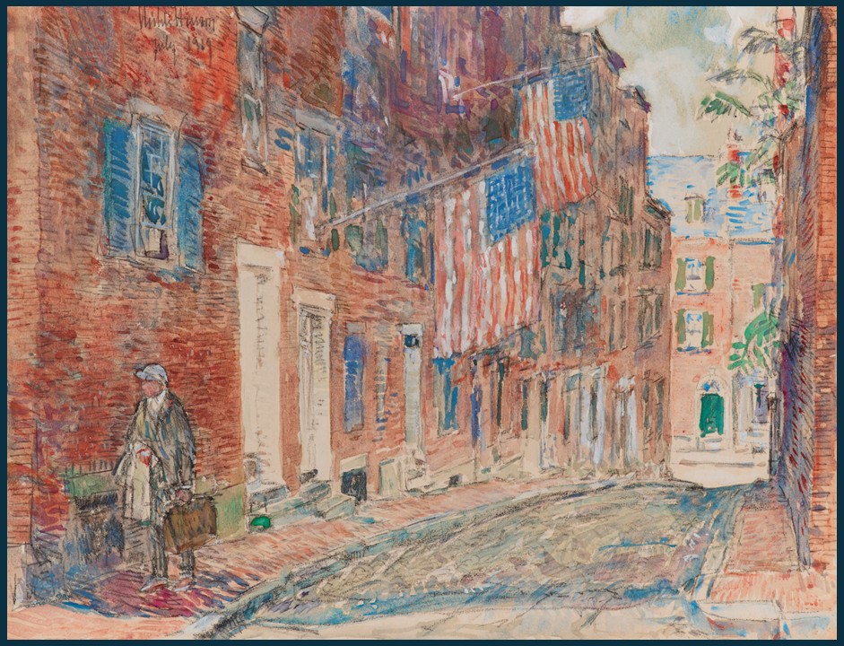
A reflective Fourth of July exploration of Childe Hassam’s Acorn Street, Boston, July 1919 and its quiet vision of American identity, history, and Impressionist light.
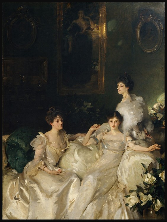
Sargent’s Portrait of the Wyndham Sisters transforms portraiture into a dynamic composition, uniting elegance, movement, and individuality while capturing psychological nuance and the interplay between heritage, identity, and modern femininity.
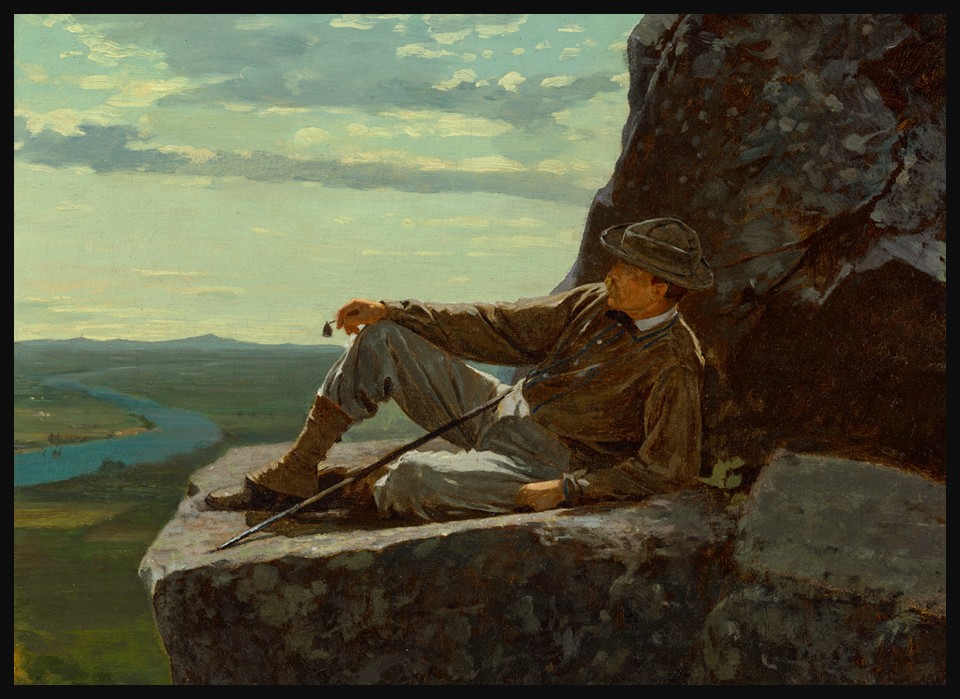
Winslow Homer’s A Mountain Climber Resting captures a quiet summit pause, reflecting rising leisure travel, shifting views of nature, and the enduring ideal of solitary exploration in nineteenth-century America.

A luminous close-up by Georgia O’Keeffe transforms sweet peas into an immersive meditation on form, perception, and the quiet power of spring’s fleeting beauty.
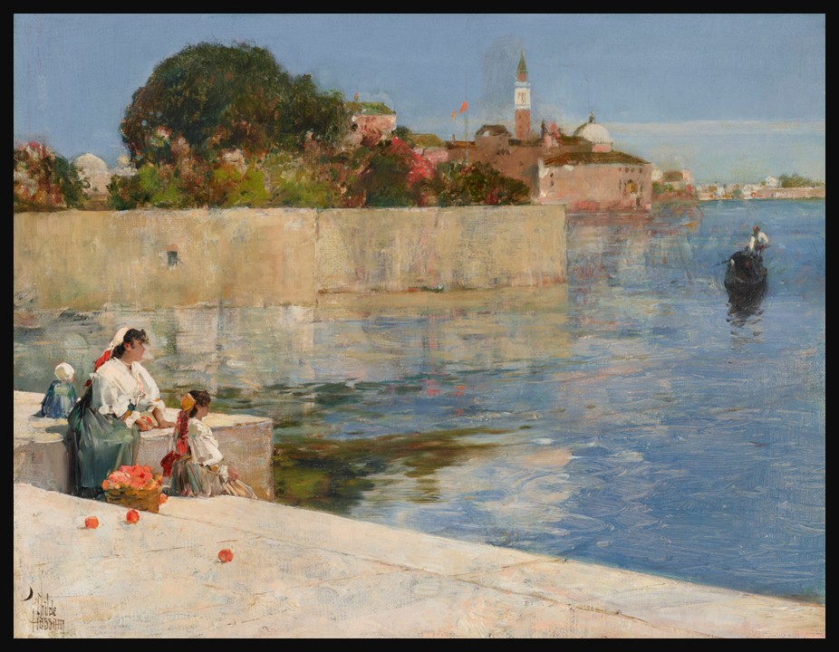
In View of Venice, Childe Hassam captures Venice’s shimmering light and movement, marking the formative moment his evolving style embraced vibrant color and modern Impressionist vision.
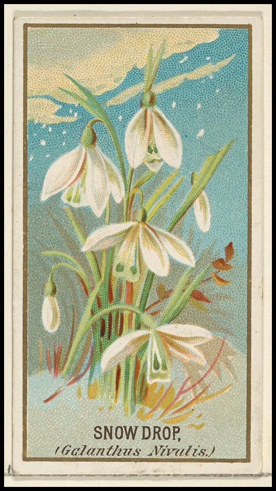
The snowdrop, Galanthus nivalis, heralds January with quiet resilience, symbolizing hope and renewal, while the Old Judge cards transform this delicate bloom into art, blending nature, culture, and everyday life.
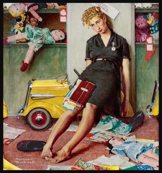
Norman Rockwell’s Tired Salesgirl on Christmas Eve reveals the quiet dignity of unseen labor, transforming a moment of exhaustion into a tender meditation on empathy, perseverance, and the human cost behind holiday celebration.
Doris Lee’s Thanksgiving (1935) captures the warmth of American domestic life during the Great Depression, celebrating community, labor, and shared tradition through a lively, humorous scene that embodies the spirit of the American Scene movement.
James McNeill Whistler’s Nocturne in Blue and Gold and Hiroshige’s Kyōbashi Bridge transform urban bridges into poetic thresholds, using light, water, and atmosphere to evoke stillness, reflection, and the quiet beauty of modern life.
Chrysanthemums, the flower of November, bridge Matsuo Bashō’s haiku meditation on autumnal impermanence with Andy Warhol’s Kiku prints, where repetition and color transform a traditional Japanese symbol into a modern reflection on beauty, memory, and cultural continuity.