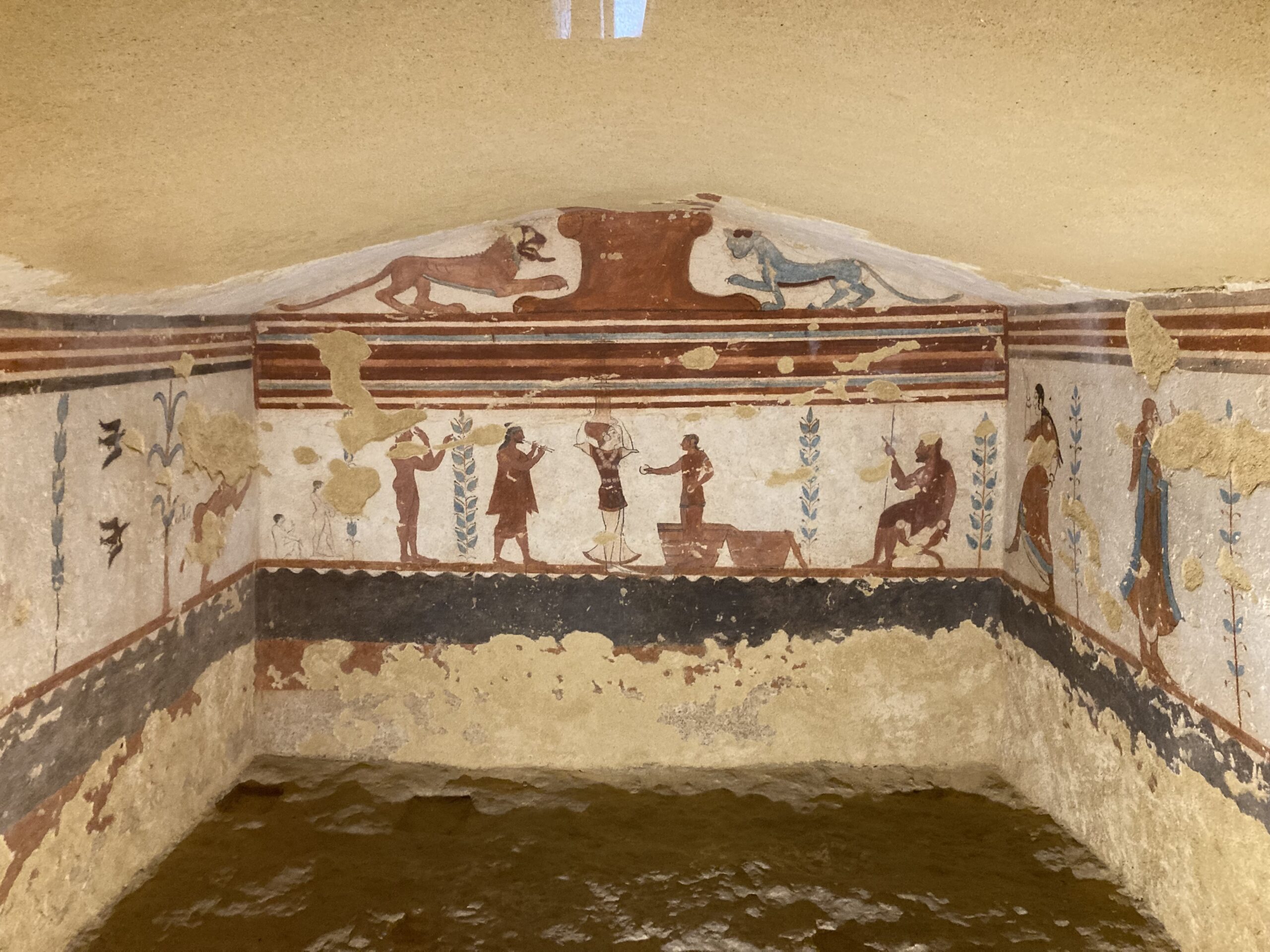
Standing within the Necropoli of Monterozzi near Tarquinia, I was immediately captivated by the Tomb of the Jugglers and its vibrant celebration of Etruscan life. Dating to the 6th century BC, the tomb’s frescoes, alive with dancers, musicians, and jugglers, transform the space from a resting place into a vivid stage of movement and rhythm. Seeing these ancient figures firsthand, their gestures still brimming with energy, offered a profound reminder of the Etruscans’ belief in life’s continuity beyond death. The paintings, both elegant and exuberant, reveal a culture that embraced the afterlife not with fear, but with the same joy and artistry that animated their time on earth.
Let’s explore the ‘who,’ ‘where,’ ‘why,’ ‘how,’ ‘when,’ and ‘what’ of this remarkable Etruscan painted tomb by posing a series of guiding questions.
What is the Tomb of the Jugglers, and why is it significant among Etruscan burials? The Tomb of the Jugglers (Tomba dei Giocolieri) is one of the many richly painted chambers in the Monterozzi Necropolis near Tarquinia, a UNESCO World Heritage Site. Unlike more somber tombs, it celebrates life through scenes of performance and movement, showing how the Etruscans viewed death not as an end but as a continuation of joyful existence. Its focus on entertainers rather than mourners makes it a distinctive example of Etruscan humanism and optimism.
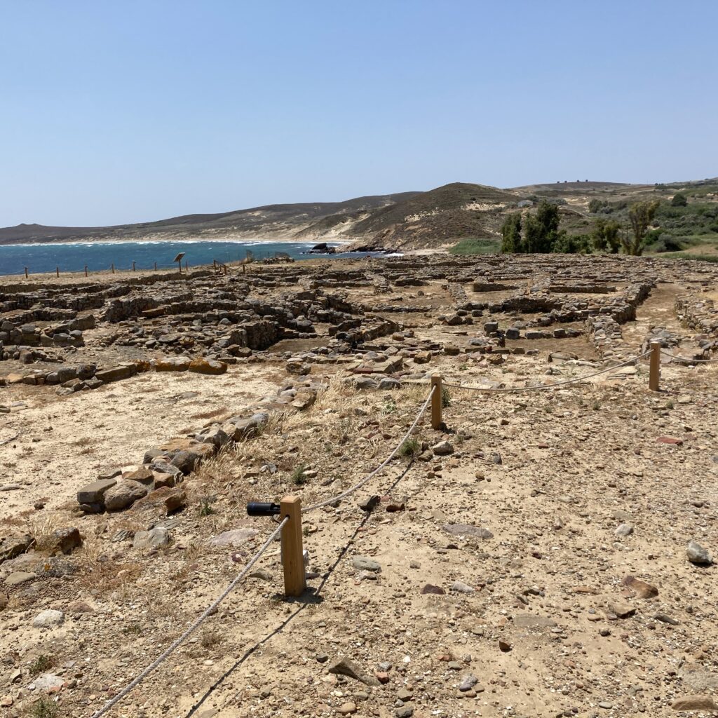
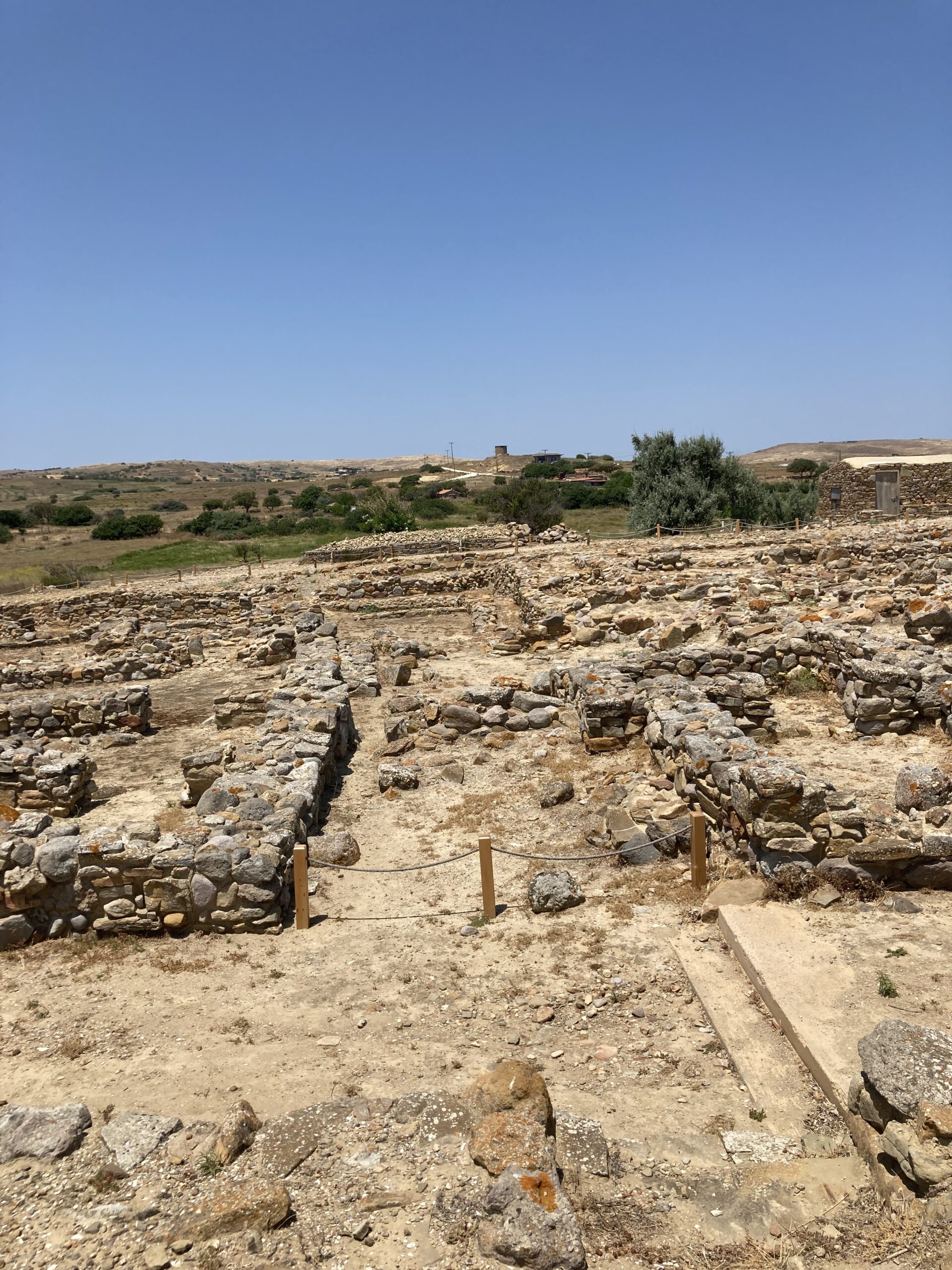
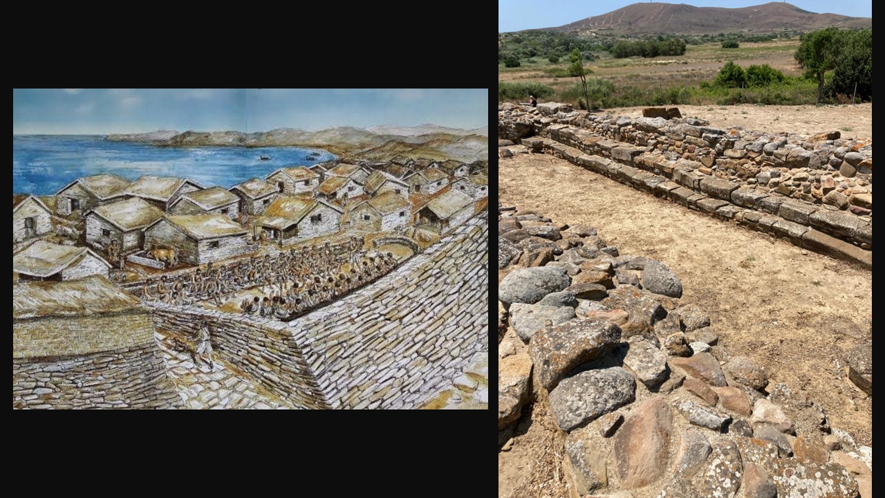
Where is the tomb located, and what is the archaeological context of the Monterozzi Cemetery? The tomb lies within the Monterozzi Cemetery (Necropoli dei Monterozzi), a vast archaeological site in Tarquinia, central Italy. This necropolis contains over 6,000 tombs, many carved into the tufa rock, and more than 200 adorned with frescoes. Together, they form one of the richest sources of information about Etruscan society, illustrating how the elite commemorated their dead with elaborate architecture and vivid art reflecting social life, music, and ritual.
When was the tomb created, and what does its art tell us about that historical period? Dating to the early 6th century BC, the Tomb of the Jugglers belongs to the Archaic period of Etruscan art, when Greek influence began blending with local traditions. The movement, color, and rhythm in the frescoes reveal an evolving artistic language, one focused on human emotion, daily life, and communal festivity rather than myth alone. It reflects a society confident in its identity and in harmony with the pleasures of living.
Who were the Etruscans, and how did their beliefs shape tomb art like this? The Etruscans were a sophisticated pre-Roman civilization that flourished in central Italy from the 9th to the 3rd centuries BC. Their religion emphasized the continuity between earthly and spiritual life, and tombs were designed as eternal homes for the soul. The imagery of feasting, dancing, and games symbolized not mourning, but rebirth and ongoing celebration in the afterlife, a vision beautifully embodied in the Tomb of the Jugglers.
What scenes are depicted on the tomb’s walls, and what might they symbolize? The walls of the Tomb of the Jugglers depict funeral games and performances in honor of the deceased. These include scenes of dancers, jugglers, musicians (like a flautist and syrinx player), and even more unusual or symbolic figures such as a defecating man—interpreted as an apotropaic (protective) image meant to ward off evil. The central figure, likely the deceased himself, is shown seated in a position of honor, watching these performances. Symbolically, the scenes represent the celebration of life and the continuation of social status after death. The games and entertainment not only honor the deceased but also reflect Etruscan beliefs in a lively afterlife where joy, music, and acrobatics accompanied the soul beyond the grave.
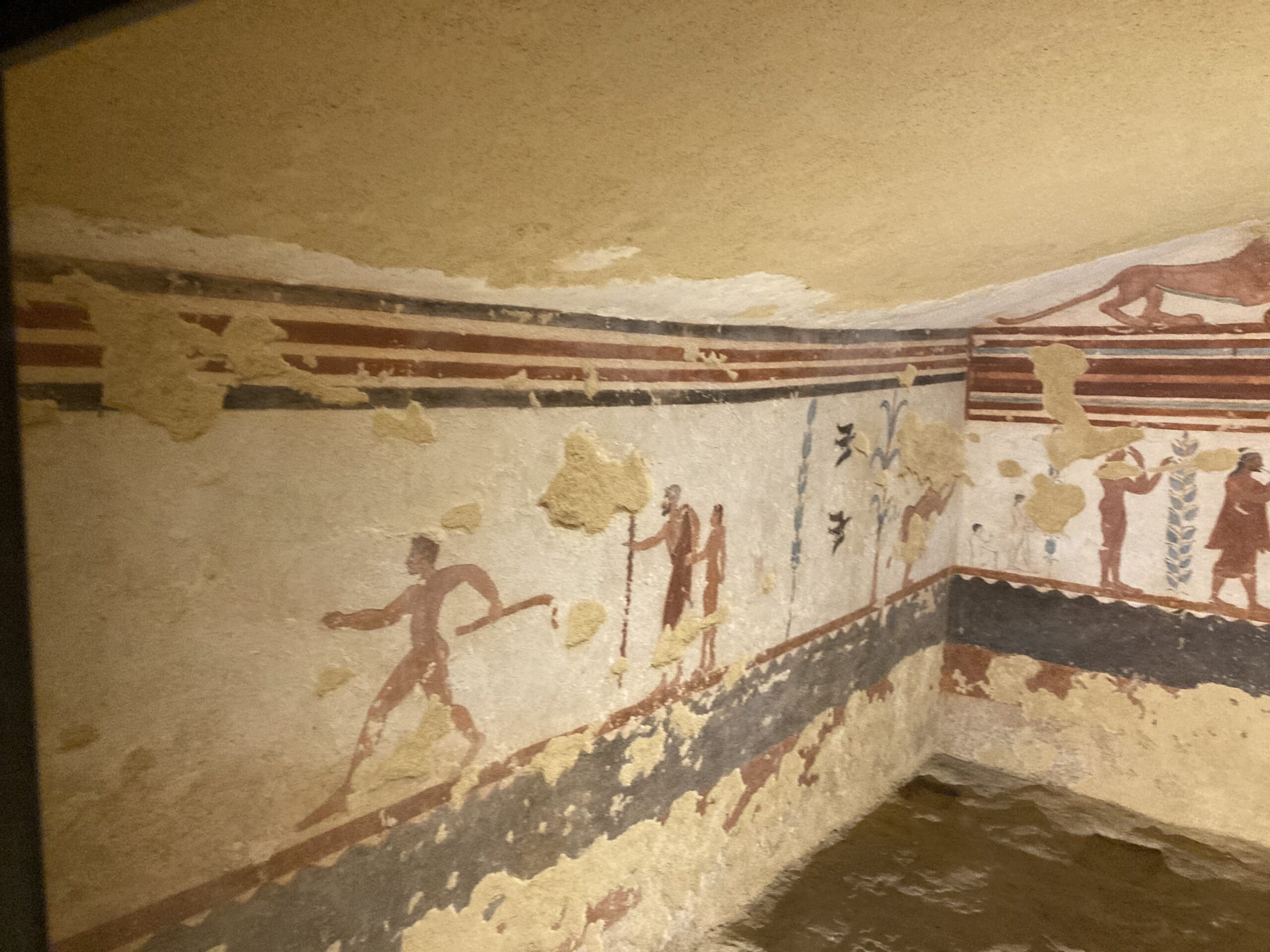
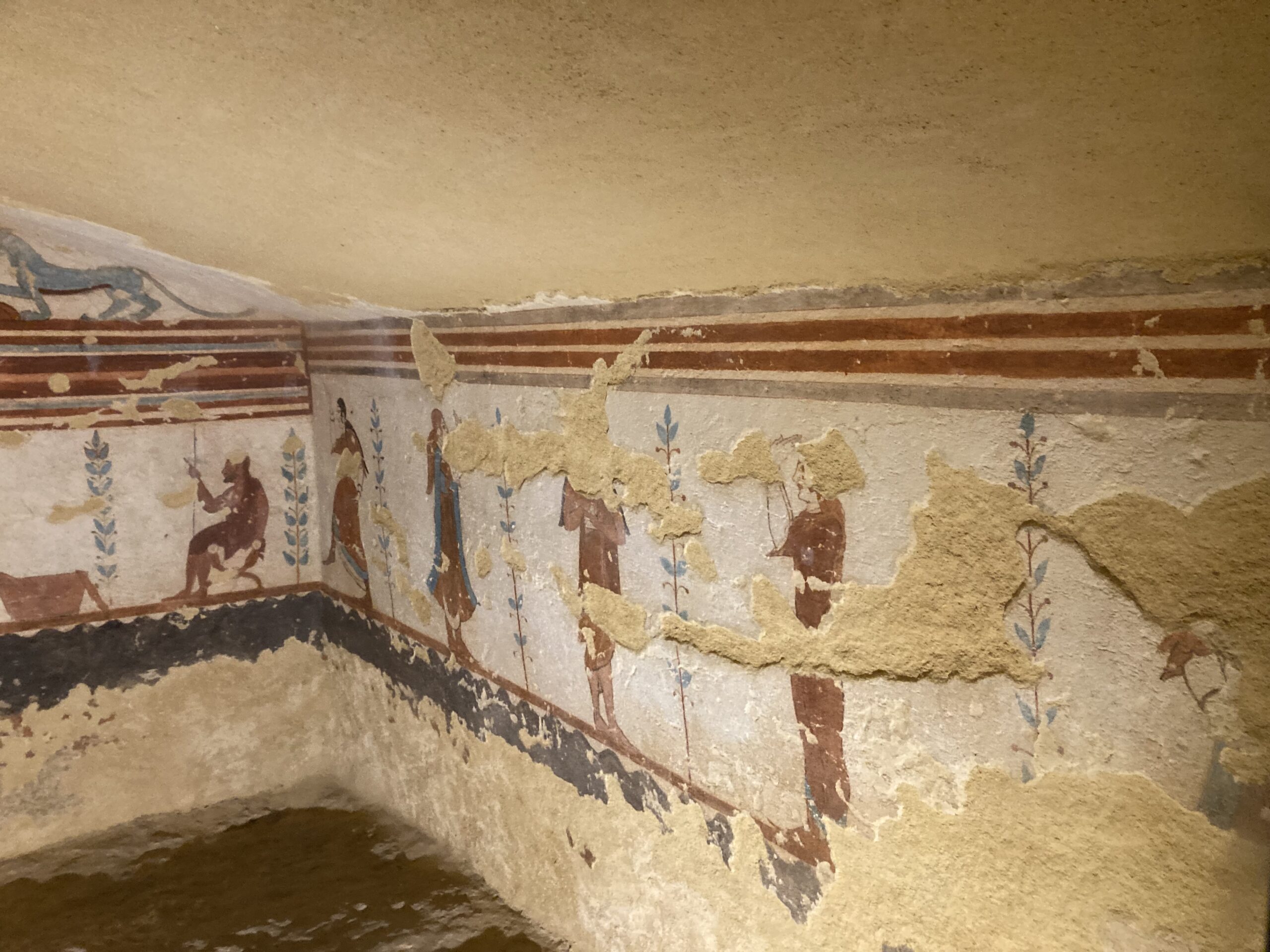
How were the frescoes made, and what techniques reveal the Etruscans’ artistic skill? Etruscan artists applied natural pigments directly onto fresh plaster in a method similar to true fresco, allowing the colors to bond with the wall surface. Earth tones of red, black, yellow, and white were carefully layered to create depth and motion. Despite their age, the figures remain remarkably expressive, evidence of the painters’ ability to convey rhythm and vitality through minimal, confident brushwork.
Why does the Tomb of the Jugglers still captivate visitors today? To stand before these ancient paintings is to witness the enduring human desire to celebrate life, even in the face of death. The Tomb of the Jugglers captivates not only for its artistry but for its message, a belief that joy, community, and creativity transcend mortality. Seeing the lively gestures of those figures firsthand reminds us that across millennia, the language of movement and festivity still speaks clearly to the living.
Visiting the Tomb of the Jugglers in Tarquinia is more than an encounter with ancient art, it is a meeting with a worldview that valued beauty, vitality, and continuity. Standing before its frescoes, one senses that the Etruscans sought not to escape death but to honor life through it, transforming their tombs into spaces of movement and celebration. The vivid dancers and jugglers painted over 2,500 years ago still perform their timeless ritual, reminding us that joy and creativity are among humanity’s most enduring legacies. For modern visitors, the experience is both scholarly and deeply human, a bridge between past and present, painted in rhythm and color.
For a PowerPoint Presentation of the Etruscan Tomb of the Jugglers, please… Click HERE!
If you’re interested in related Etruscan tomb painting, you may also enjoy my post on the Tomb of Hunting and Fishing… https://www.teachercurator.com/uncategorized/tomb-of-hunting-and-fishing/
Bibliography: https://tarquiniaturismo.com/tomb-of-the-jugglers/?lang=en and https://archaeology.brown.edu/native-publications/tomba-delle-leonesse-and-tomba-dei-giocolieri-tarquinia and https://www.youtube.com/watch?v=9KkvNlESHNE